Saturday, November 25, 2017

How to Create an Interesting Still Life


Whether you are just learning to draw or paint or have many years of experience under your belt, a still life is an excellent way to practice your rendering skills. Unlike working on location or from a live model, you can control the weather, keep the lighting consistent, and your subject is unlikely to fidget, want to chat, or need a potty break. But do be aware that for an interesting picture, you must have an interesting still life; you can’t just throw things on a table and call it good. Here are some suggestions to make your still life setup creative, interesting and well-balanced.

Variation. This is the main watchword for still lives; variety is the spice of life, and a still life needs spice, too! Give the viewer some different things to look at by varying the sizes, shapes, textures and colors of your setup. Imagine how a brilliant, velvety red rose would look against a fuzzy white shawl, with a shiny black glazed pitcher in the background! Make sure you use contrast to your advantage—don’t make everything light, or dark, or soft, or shiny. Mix it up and your picture will be much more lively!

Elevation. Also when setting up your still life subject, try to vary the elevations, as well—either use taller things to contrast with shorter, or use props to create different levels. For example, you could place boxes of different sizes under a drape and arrange items on the differing levels created, or you could stack smaller things on books of varying sizes.

Focal Point. While you do want a variety of objects in your picture, you should give the viewer something to home in on so that your picture draws attention in the first place. You will want to have one main subject to act as the star of the show, and once the viewer is drawn by this, the supporting players will be there to add variety and interest. The best results are usually obtained by selecting one really fascinating piece, such as a gorgeous cut-glass vase or a brightly-colored kite, then choosing a few other items that provide contrast in color, size and texture. In this picture by French painter Anne Vallayer-Coster, the ham is clearly the star of the show, but there are a lot of supporting players that add a variety of textures, colors and shapes to create interest. 


Themes. Most people think of a vase of flowers or a bowl of fruit when they think of a still life subject (or both, as seen in the picture at top, by Flemish artist Clara Peeters). These are fine, but you should also try to come up with more creative setups. Pick a theme for your still life, and then try to come up with all the things that could fit the theme. You might choose music as a theme, and you could feature a beautiful old violin as your main subject and then add in the bow, some sheet music, a metronome, a pair of opera glasses and some white gloves. You could pick food as the theme, but instead of the typical bowl of fruit, you could use vegetables instead, or even candy displayed in different dishes and scattered across a cloth. As a student, I drew a still life of the “heavy metal” theme, composed of spiked and studded leather cuffs and belts from my own rockin’ wardrobe!

Personalization. Did you know that you can actually make a portrait out of a still life setup? Instead of making a direct likeness of your sitter, use meaningful objects from their life, such as mementos, awards, and any items that reflect their personal interests or hobbies. If your client is a baseball enthusiast, for example, you could make a still life from their own collection: maybe an autographed ball or glove, a pennant from a favorite team, a pair of tickets and a game schedule, even a box of Wheaties with their hero on the front. Or instead of a theme, use many different items to represent all of their interests, like posters of favorite movies, favorite books, musical instruments, travel souvenirs and so forth. Use your imagination and get creative! This is a great way to make a special, personalized picture for someone who is shy or uncomfortable with the idea of having their portrait made.

Now that you know that still lives can be so much more than just a bunch of flowers or a bowl of fruit, go find yourself some cool African sculpture, antique beer steins or carved wooden toys and set up something that will really make an interesting picture. After all, if it ain’t creative, it ain’t art!


See my breakdown of a Vincent vanGogh's still life, here:  http://allsortsartbyali.blogspot.com/2014/11/van-goghs-stillleben-mit-gelbem.html

Make sure your still life has a strong focal point! These tips will help: http://allsortsartbyali.blogspot.com/2015/05/painting-composition-101-creating.html

At top:  Still life painting by Flemish painter Clara Peeters, from Wikimedia Commons
https://commons.wikimedia.org/wiki/File:Clara_Peeters_-_basket_of_fruit_with_a_tazza_holding_grapes_a_bouquet_of_flowers_and_a_flagon_WA1940.2.61.jpg

Still life with ham by French painter Anne Vallayer-Coster, from Wikimedia Commons
https://commons.wikimedia.org/wiki/File:Still_Life_with_a_Ham.jpg

For regular shenanigans, please follow my Facebook page, https://www.facebook.com/allsortsofart

Saturday, September 23, 2017

The Empire of Light


Above is a painting by my favorite artist, Belgian surrealist RenĂ© Magritte  (1898 – 1967), called The Empire of Light. It's actually one of a series, and all the paintings have the same title, so they have to be distinguished by their locations--this one is in the Royal Museums of Fine Arts of Belgium, located in Brussels. 

The series, which attempted to show a juxtaposition of a street at night against a sunny, daylight sky, was painted in 1953-1954. One website states that the painting "became so popular that he made several versions", but I think that it's possible that Magritte painted several versions because the subject is very challenging, and he was trying to get it just right. He was attempting to show a surreal contrast between night and day, but there is a time in the evening that the sky is still pretty bright, even when the city below is cloaked in shadow, and he had to strike just the right balance to make us realize that it was, in fact, a daytime sky, and not simply a twilight one. For example, this one, at the Museum of Modern Art, could be mistaken merely for a twilight picture: 


I think of all the paintings in the Empire of Light series, the one at the Royal Museums in Brussels does the job best, probably because of Margitte's choice to include the large puddle on the street. It accurately reflects the night scene, but is unaffected by the blue sky above. This makes a stronger statement, in my opinion, of the marked difference between day and night, eliminating the possible confusion of twilight. 

If the images seem familiar to you, it might be because you own or have seen the 1974 album cover of Late for the Sky by Jackson Browne, which was inspired by the painting(s). There is actually a credit inside the album that says,"cover concept Jackson Browne if it's all reet with Magritte". Magritte was dead by then, but I guess it was "all reet" with his estate.  

By Source, Fair use, https://en.wikipedia.org/w/index.php?curid=33329375
https://en.wikipedia.org/wiki/File:The_Empire_of_Light_MOMA.jpg

For regular shenanigans, please follow my Facebook page, https://www.facebook.com/allsortsofart

Thursday, June 1, 2017

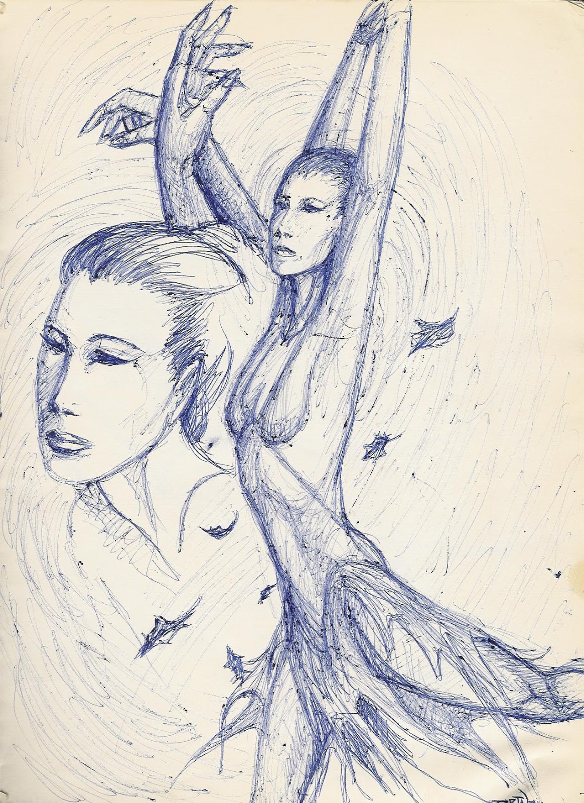
From the Sketchbook - "Eroche"


This drawing was a concept sketch for a painting entitled "Eroche" (pronounced arrow-key). The name doesn't really refer to anything; it just came to me from nowhere and I liked the sound of it (seems vaguely Greek, like Eros). Since it was just a sketch and not a finished piece of art, ball-point pen was the weapon of choice, although to be honest, I actually have produced finished art in ballpoint (mea culpa).

The composition in this sketch seems to be for a montage, but I really was just adding individual studies for the hands and face. I didn't envision more than just the single figure in the picture, but since her hands didn't make it onto the page in the larger version, I wanted to work them out in detail. The position of the hands is about right, but I have no idea why I made the fingernails so long, and I would definitely change that in the final piece, should I ever get around to producing it.

This was drawn from an artistic "vision" that I had--not a mystical type of vision, just a creative picture in my head that was pretty fully realized, of a dancer in an arabesque posture, amid a swirling of fallen leaves. Her skirt has a fluttering hem that mirrors the edges of the leaves.

Where did the flying leaves come from? I was actually inspired by this video for the song "Whisper To A Scream (Birds Fly)" by the 80s band Icicle Works https://www.youtube.com/watch?v=NVQCpI4GbKQ . That video is predominantly brown in tone. I would like to make the painting monochromatic, as well, but I think it has more of a blue feel to it. I do love the imagery and movement of the flying leaves, but I wouldn't use as many as they did in the video--the torrent of leaves seems very chaotic, and I am trying to achieve more of a lilting feel.

Image is of my own artwork. All rights reserved.

For regular shenanigans, please follow my Facebook page, https://www.facebook.com/allsortsofart

Friday, March 31, 2017

Wonder Woman vs The Rockets - Original Comic Art


When I was six years old, the first comic book I read was Wonder Woman, and she's been my hero ever since. Beautiful, intelligent, and strong, she represented all the physical, intellectual, and moral ideals one could achieve. It also didn't hurt that, with her long dark hair and blue eyes, I had a role model that actually looked like me, as opposed to those blonde, princess-y types who supposedly epitomized loveliness, like Barbie. I imagine the little red-haired girls adored Batgirl in much the same vein.

Being of an artistic nature, I drew a lot, and one of my favorite subjects was Wonder Woman. Here I have used pen and ink and art markers on bristol board to depict her in a race against time, readying her unbreakable golden lasso to try to rope some hostile ordnance that has been launched against innocent targets. She has super-speed and strength, but it seems her work is cut out for her. Will she stop the malicious missiles in time? Well, of course--she's Wonder Woman!

More of my comic art:
http://allsortsartbyali.blogspot.com/2016/04/original-comic-art-silver-age-wonder.html
http://allsortsartbyali.blogspot.com/2015/05/superman-batman-superbat.html
http://allsortsartbyali.blogspot.com/2015/03/batgirl-wonder-woman-wonder-bat.html
http://allsortsartbyali.blogspot.com/2014/12/a-portrait-of-cheetah-wonder-womans.html

The character of Wonder Woman is (c) DC Comics, Inc. 


For regular shenanigans, please follow my Facebook page, https://www.facebook.com/allsortsofart


Tuesday, November 15, 2016

Image of Thanksgiving: Thanksgiving Dream


Here is my pen and ink drawing for the month of November from the calendar that I designed for the Blood Donor Center at Thomas Jefferson University Hospital in Philadelphia, Pennsylvania. I composed a little poem to go with it:

Twas the Night before Turkey, and deep in his sleep
Came a dream about all of the food he would eat
Turkey with stuffing, and all those good things
He's drooling before the alarm even rings!

Image is my original artwork. Click to enlarge!

For regular shenanigans, please follow my Facebook page, https://www.facebook.com/allsortsofart

Saturday, April 23, 2016

Original Comic Art - Silver Age Wonder Woman


I figured it's time to do another art post, so I went looking in my picture folder and found this drawing of Wonder Woman. She's always been my favorite superhero and obviously one I enjoy drawing. Her costume has had a few redesigns over the years (we won't talk about the leather jacket---harrrumph), and this outfit is from the "silver age" (50s and 60s).

When Princess Diana was originally introduced to the world, she wore a star-spangled skirt, but it was quickly replaced by a pair of long shorts more befitting her rather active lifestyle of leaping tall buildings and chasing after bad guys. That was still in the golden age, though. In the silver age, a lot of "origin" stories came out--besides a retelling of how Wonder Woman came to our world and decided to fight crime, there were even stories of how she earned the different parts of her costume, such as the eagle, the stars, etc.

I think it might have been this return to her mythological roots that led to a redesign of her footwear, which had been high-heeled boots. They were replaced by sandals with long laces that criss-crossed her lower legs and seemed more Greco-Roman (despite being bright red). She also still had the tiara that encircled her whole head; the next redesign would see that tiara become an arc rather than a circlet, so it could go under her luxuriant hair instead of holding it down. Also so she could use it--as a boomerang!


Another example of my original comic art: http://allsortsartbyali.blogspot.com/2014/12/a-portrait-of-cheetah-wonder-womans.html

Image is my original artwork. The character of Wonder Woman is (c) DC Comics, Inc.

For regular shenanigans, please follow my Facebook page, https://www.facebook.com/allsortsofart

Tuesday, February 23, 2016

Learning to Draw: First Step? Have the Right Attitude


In my experience as an artist, I have frequently mused at the reactions of people to my drawing ability. Many people treat me with almost a kind of reverence, like I'm a precious creature with secret, magical powers. And my students occasionally express shock and, well, awe after I have illustrated a concept with a quick yet accurate drawing, seemingly effortlessly. I certainly don't mean to intimidate them; I hope that instead they will learn that since it's easy for me, it will be easy for them, too, if they keep at it.

It is easy, after you've been practicing for years! But practice, not some magic lightning bolt of talent, is what will polish your skills and make drawing second nature to you. In my case, my mom was an artist, so I had a natural environment of support and development growing up. Furthermore, I attended an excellent art school at which I received top-notch instruction.

So, look at it this way: Suppose my fluent Russian impresses you. But if my mom spoke fluent Russian, it would be no surprise to hear that I grew up speaking Russian, and if I also managed to attend Russian school to perfect my Russian, I doubt you'd think my fluency was an amazing, God-given talent. You might be impressed by my achievement, but you wouldn't be discombobulated by it, and most importantly, you wouldn't think you couldn't possibly do the same thing yourself, if you wanted to.

And yet, I run into this attitude so frequently from my beginning students. I even get it myself, from time to time: I see a piece of artwork that is so creative and well-executed that I think, "I could never do that!" And yet, I could do it; it's just a matter of investing the time and energy in acquiring the necessary skill, so I correct myself and never say never. Because I think in a positive way, when I see really cool artwork by other people, I don't compare my own unfavorably--indeed, I feel very inspired to do more of my own!

The process of creating artwork can be kind of frustrating, even for very experienced people, but it is greatly rewarding. Very often when I am working in a medium that has to be layered to be properly developed, like paint or pastel, I will find myself at an intermediate stage wherein my sketch has been obscured, but the picture isn't developed enough to look like anything yet, least of all the subject, and I will have a small attack of conniptions, thinking, "Good grief, what a mess! This isn't working at all-what was I thinking?"

Then, after I remind myself that I go through that "awkward phase" with almost every picture and they always seem to turn out fine, I calm down and see things through. The final product almost always satisfies me completely, and it always amazes me to think I got a finished piece of artwork out of a piece of paper or canvas and a handful of art supplies. I might be tired or drained afterward, but it's a good kind of tired, like you feel after a killer workout, knowing you've accomplished something. Even if the picture comes out unsuccessfully, you have still gotten the practice, the experience, and learned which approaches don't work, which is actually an important step in the learning process.

So, instead of being intimidated when you are learning how to create art, why not be excited? A whole new world is opening up to you, and there are so many things you can learn and do in that world! After all, you fell on your bum a lot when you were learning to walk and thought nothing of it. Why not take the inevitable drawing errors in stride as well, knowing you'll get better?

And see, that's the coolest part of all, and it's what should make you delighted to keep practicing: You will only get better. It's like riding a bicycle; you can't "unlearn" it. You can improve your skills with every single drawing you do. Isn't that neat? I think so. And once you acquire your skills, you don't lose them; you just continue to build on the foundation. So don't be intimidated, be excited, and get out there and do some art!

For more art instruction:
 http://allsortsartbyali.blogspot.com/2015/03/i-have-been-professional-portrait.html
 http://allsortsartbyali.blogspot.com/2015/03/figure-drawing-101-wacky-secrets-of.html
 http://allsortsartbyali.blogspot.com/2015/05/figure-drawing-101-so-you-wanna-be.html
 http://allsortsartbyali.blogspot.com/2015/05/painting-composition-101-creating.html

Image is my original work. Copyright law prohibits any reproduction of this work without my written permission. 

For regular shenanigans, please follow my Facebook page, https://www.facebook.com/allsortsofart