Showing posts with label painting. Show all posts

Friday, May 8, 2026

Miya HIMI Jelly Gouache Color Review #7: Black and Nude

Goodness, it's been a while since I made a post on this. My apologies to those of you who have been waiting in real time for the final post in this series (although if you followed my page on Facebook, I'm sure you saw the finished painting quite some time ago). 

This is the seventh in a series of reviews of the individual colors from the Miya HIMI brand 24-color “jelly” gouache paint set. This review will concentrate on the Miya HIMI Black and Nude jelly gouache paint colors and will also include updates on my Star Trek painting and how my swatch chart is coming along.

Miya HIMI Jelly Gouache color Black


Last time, I painted Captain Picard's uniform tunic, using Deep Red for the shadow areas and Ponceau to balance out the bright, neutral red. I needed to paint the black part of Picard's tunic, and I decided to paint his horse body in a grey Appaloosa style, both to match his grey hair (he has some hair!) and to contrast with Kirk's golden brown satyr body. It also coordinated nicely with his tunic, like Kirk's coloration coordinated with his. I used the Black and White colors to do this and also to paint Kirk's horns and hooves so they would stand out more from his hair and furry legs. 


The Black swatched out with a high opacity and medium granularity on the black and white charts.   


Miya HIMI Jelly Gouache color Nude


I chose to paint the faces and hands of Kirk and Picard before painting their instruments, which were in front of their mouths (as we've learned through this series, I always start in the background and go forward, even when it gets granular, like this). 


The Nude had medium opacity and granularity on the black and white swatch charts. 


The Nude color was quite pale. Suitable for Patrick Stewart's British pallor (or should I say pallour), but I did need to mix in a little of the previously-opened Burnt Umber and a smidge of Ponceau to paint that tan Canadian, Shatner. 

I used some of the more tan color for Picard's lips and cheeks. After that, I was able to paint Kirk's pan flute with the Umber and Earth Yellow. I painted Picard's flute and added details with White, like the Captain's rank (four dots) on his collar and the "silver" background of his communicator badge. With these finishing touches, the painting was complete! 


I must say, it has been a real pleasure working with the Miya HIMI Jelly Gouache. It's very easy to use and to reactivate when dry. The colors mix well and it applies evenly. Of course, the colors dry either lighter or darker than you'd expect, but that's gouache for you. That's why we make swatch charts! 

For the original post describing the unboxing of the Miya HIMI jelly gouache paint set, go here: https://allsortsartbyali.blogspot.com/2023/03/unboxing-himi-jelly-gouache-24-color-set.html


For regular shenanigans, please follow my Facebook page, https://www.facebook.com/allsortsofart

Wednesday, July 2, 2025

Basic Information about Gouache Paint


If you are unfamiliar with gouache (pronounced GWAHSH), it is typically described as an opaque watercolor, although when diluted with water, it can be used transparently, as well. As with traditional watercolor, it doesn't dry waterproof, so be aware that if you paint over it, you could activate the dried layer if you use enough water. This can be great, as it makes the colors blend easily and gives you the ability to soften edges and spread color. It can also be annoying, of course. Be careful not to get drips or spatters of water on the dried paint surface, as this can create spots.

The opacity enables you to use the paint on dark surfaces, though, which can create interesting results. I painted this nighttime scene of my bedroom with white gouache on black bristol board. I especially like the reflection of the edge of the pillow against the night-darkened window glass. That kind of effect would be harder to achieve with a different medium. 


Gouache paint dries matte, like that tempera paint you probably used in grade school. The two paints actually look very similar in their finished state, but tempera dries permanent and gouache is rewettable/reworkable, as we've discussed. The paints have different binders – traditionally, egg yolk for tempera and gum arabic for gouache. There is also a type of gouache called acrylic gouache that dries permanent, like acrylic paint. I prefer workable gouache, since I already work in acrylic and can use that if I want a more permanent finish. 

Gouache has been around for quite a long time, but it was considered more of a designers' medium (that is, more for advertising and design layout sketches than for finished pieces - even my painting above was just a tonal study for a larger piece). However, it's been getting a bit of a renaissance lately, via art YouTube channels, since it is colorful, fun, and easy to use. I have been getting back into it myself and really enjoying it! I bought myself a set of Miya's HIMI jelly gouache and am in the process of posting some reviews of it showing the different colors and a gouache painting in progress. 

For the initial unboxing: https://allsortsartbyali.blogspot.com/2023/03/unboxing-himi-jelly-gouache-24-color-set.html 

The reviews start here: https://allsortsartbyali.blogspot.com/2023/06/himi-jelly-gouache-color-review-1-sky.html

For regular shenanigans, please follow my Facebook page, https://www.facebook.com/allsortsofart


All images are copyrighted property of the author and cannot be used without written permission.

Sunday, June 1, 2025

Miya HIMI Jelly Gouache Color Review #5: Earth Yellow and Burnt Umber


This is the fifth in a series of reviews of the individual colors from the Miya HIMI brand 24-color “jelly” gouache paint set. This review will concentrate on the Miya HIMI Earth Yellow and Burnt Umber jelly gouache paint colors and will also include updates on my Star Trek painting and how my swatch chart is coming along. (The previous review can be found here:

 https://allsortsartbyali.blogspot.com/2024/04/himi-jelly-gouache-color-review-4-jade.html )


Miya HIMI Jelly Gouache color Earth Yellow 050


With the background finished, it was time to start on my figures. Animal bits aside, this was still Kirk and Picard, so I needed to ensure they were recognizable. The easiest way to do that was by including their uniform jackets. Despite the whole green/gold controversy surrounding Kirk's uniform, I always saw it as gold, so I needed a yellow ochre-ish color. The HIMI set has a color called Earth Yellow that is the right shade, so I busted that out and swatched it, then painted the base color of Kirk's jacket. It was a very straightforward match – no color-mixing necessary. 


As you can see from the swatches, Earth Yellow has a strong opacity with some marked granularity, typical of earth tones.


Miya HIMI Jelly Gouache color Burnt Umber 046


Next, I needed a brown color for Kirk's goaty lower body. I also needed to mix a shadow color for his jacket and some brown for his hair. Burnt Umber, a slightly cool, dark brown, blended well with the Earth Yellow gouache to create a neutral, mid-range brown to create the shading on Kirk's jacket and his brown hair. 


Then I flipped the script and used the Earth Yellow to create highlighted areas on Kirk's satyr legs and hair. The colors mix very well and application was smooth, as with the prior colors. 


The Burnt Umber was a lovely chocolate pudding color – very tempting! As with its fellow earth color, Earth Yellow, the Burnt Umber had strong opacity and granularity. These are also probably the most lightfast hues in the collection, another feature of earth tones.


A look at the swatch chart shows several of the color mixes as well as the comparison of the lighter and darker and warmer and cooler colors. I've only done a few 50/50 mixes so far, as I was focusing more on getting the painting done for my friend's birthday, but I did swatch a mix of the Earth Yellow and Burt Umber, which appears halfway down the right edge, where the two colors converge on the grid. As you can see, it makes a lovely golden brown. 


The birthday card was starting to take shape - as you can see above, I filled in the lettering, since the background was complete. 


Next review can be found here: https://allsortsartbyali.blogspot.com/2025/07/miya-himi-jelly-gouache-color-review-6.html

For the original post describing the unboxing of the Miya HIMI jelly gouache paint set, go here: https://allsortsartbyali.blogspot.com/2023/03/unboxing-himi-jelly-gouache-24-color-set.html

For the first review in the series and an explanation of the painting and its very particular subject matter, go here: https://allsortsartbyali.blogspot.com/2023/06/himi-jelly-gouache-color-review-1-sky.html


For regular shenanigans, please follow my Facebook page, https://www.facebook.com/allsortsofart


Saturday, April 6, 2024

HIMI Jelly Gouache Color Review #4: Jade Green, Grass Green, and Yellow Green


This is the fourth in a series of reviews of the individual colors from the HIMI brand 24-color “jelly” gouache paint set. This review will concentrate on the HIMI Jade Green, Grass Green, and Yellow Green jelly gouache paint colors and will also include updates on my Star Trek painting and how my swatch chart is coming along.

Setting aside the mint green grass debacle (see the review of HIMI Gouache color 005 – Pale Green for that https://allsortsartbyali.blogspot.com/2023/09/himi-jelly-gouache-color-review-3-pale.html) for a while, I turned back to working on the background of the painting. I needed a line of trees in the background, and so I was looking for a green that was darker but very cool, since cool colors recede.


HIMI Jelly Gouache color no 002 – Jade Green


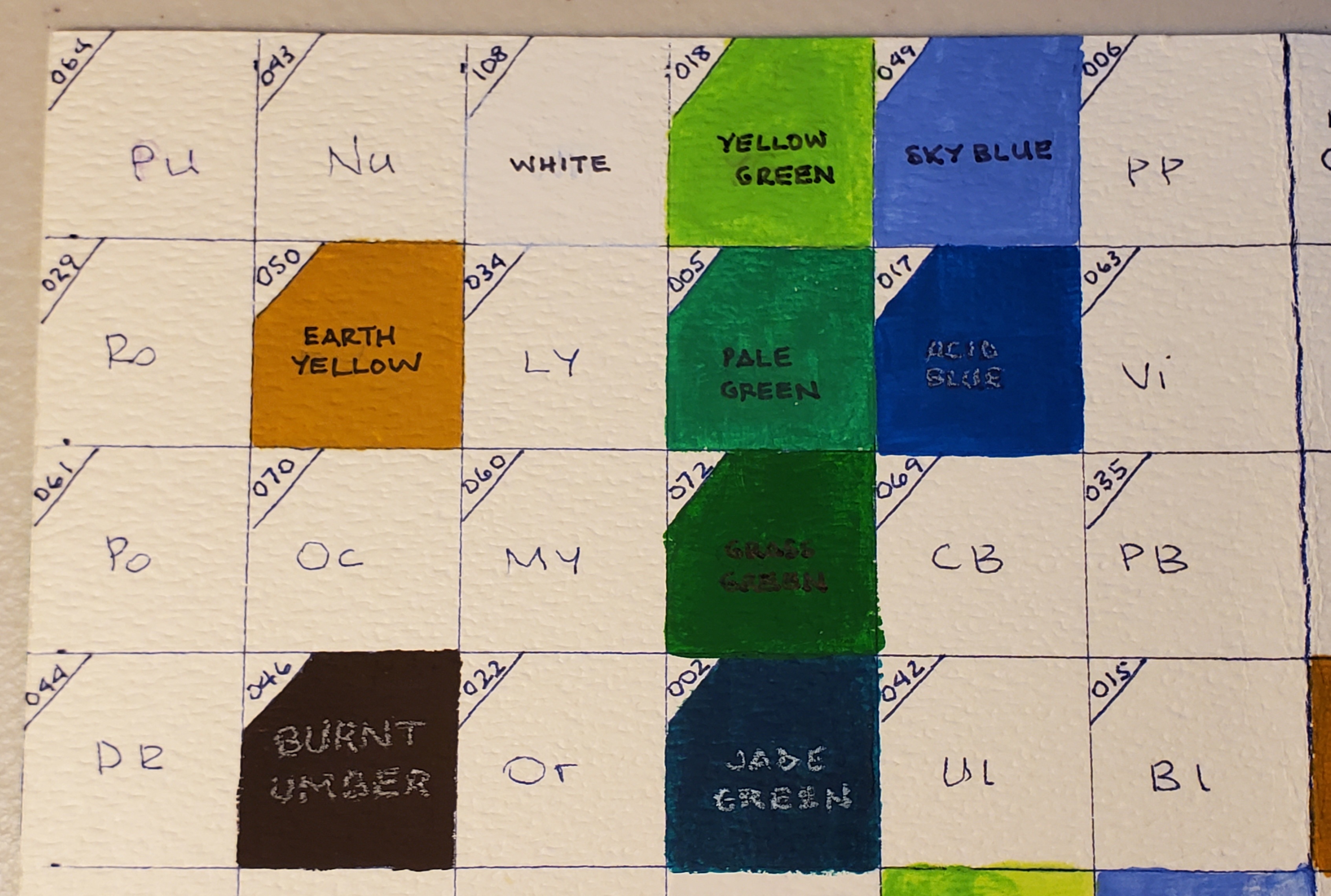
There was a color in the collection called Jade Green - this is HIMI gouache color 002. It is a very dark color with a very cool cast, kind of like the green version of the Acid Blue that I discussed in a previous post (https://allsortsartbyali.blogspot.com/2023/07/himi-jelly-gouache-color-review-white.html). 

As with the other colors, it was very creamy in consistency once I had given it a good stir to get it well-blended. It was very dark, but gouache is easily lightened by diluting it with water or by mixing it with white or lighter colors. Since this was for the background and it's best to work thin-to-thick, I chose to simply dilute with water for the lighter bits. It made a good color for the background trees, so I went ahead and painted in the treeline and then added the Jade Green to my swatch charts.


HIMI Jelly Gouache color no 072 – Grass Green


Now that the trees were established in the background, I went back to working on the grass to complete the background of the picture. The obvious choice at this point was Grass Green, at which I had turned up my nose before. Not surprisingly, it ended up being an appropriate color for the grass, as you can see in this picture.


HIMI Jelly Gouache color no 018 – Yellow Green


I also added the color Yellow Green to highlight the areas where the sun would naturally be striking the grass, so that I could have a nice sunny meadow to compliment my bright blue sky. As you can see from the swatch chart at the top of the page, the Grass Green and the Yellow Green are extremely warm - that is, they have a lot of yellow in them - in contrast to the Jade Green and the Pale Green colors, which are extremely cool, meaning that they have a very blue undertone.

Now the background of the picture is pretty much complete, and I can move along to painting my characters!


For the original post describing the unboxing of the HIMI jelly gouache paint set, go here: https://allsortsartbyali.blogspot.com/2023/03/unboxing-himi-jelly-gouache-24-color-set.html


For the first review in the series, go here: https://allsortsartbyali.blogspot.com/2023/06/himi-jelly-gouache-color-review-1-sky.html


For regular shenanigans, please follow my Facebook page, https://www.facebook.com/allsortsofart


Saturday, July 22, 2023

HIMI Jelly Gouache Color Review: White, Acid Blue


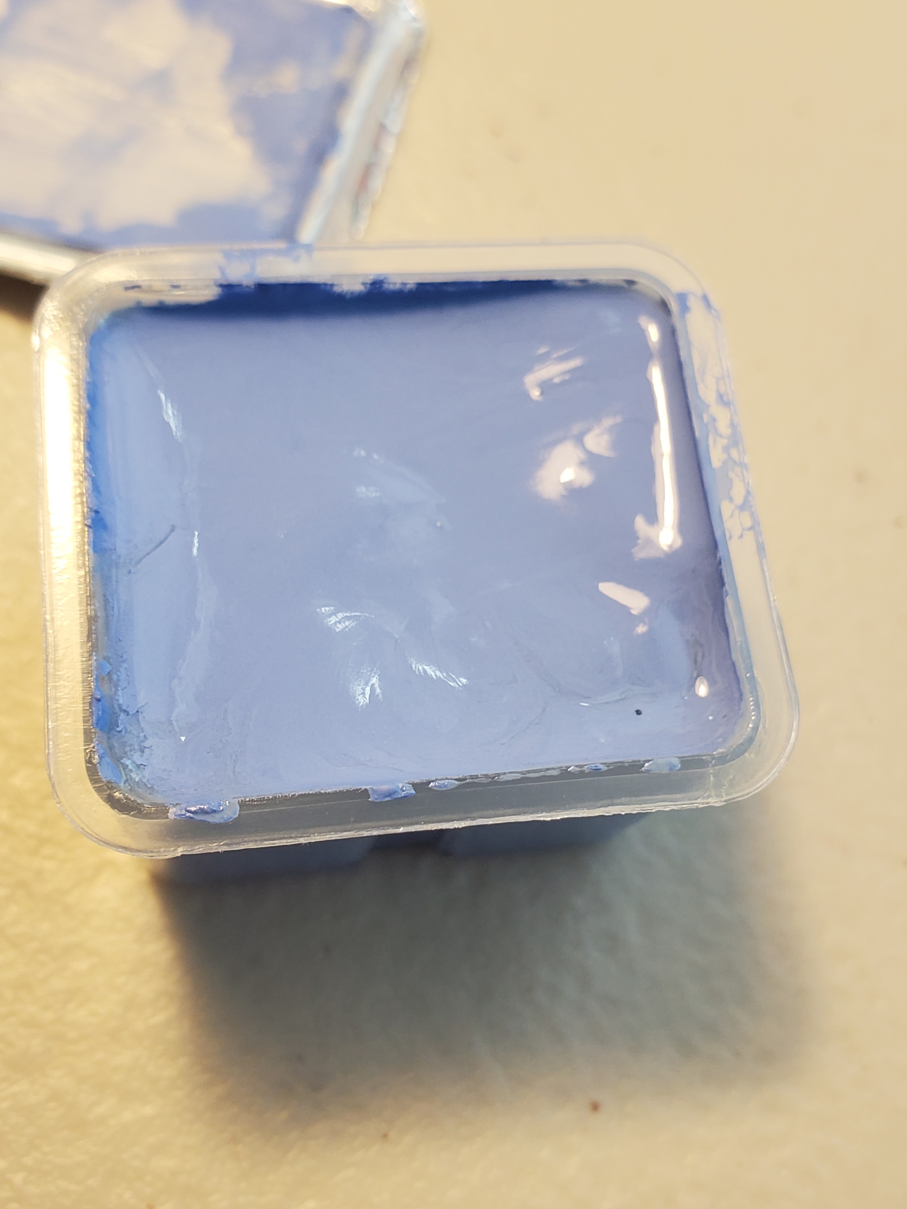
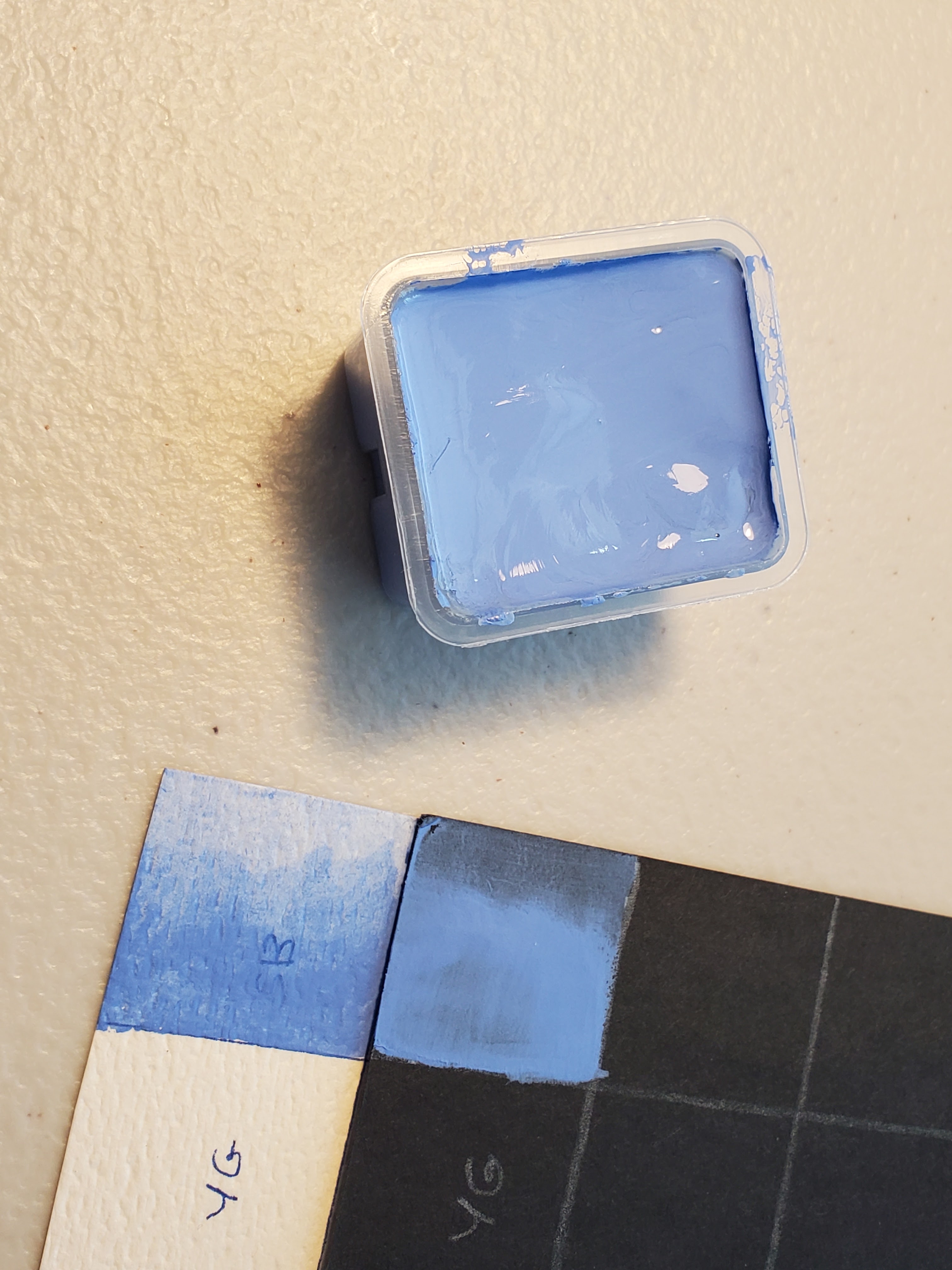
In the prior review https://allsortsartbyali.blogspot.com/2023/06/himi-jelly-gouache-color-review-1-sky.html,  I described my swatch charts and how I would be reviewing the HIMI gouache colors as I opened each one up to use in a small painting with a mythology/Star Trek theme done on a birthday card for a friend. The painting is an outdoor scene, and I wanted to start with the sky, but alas, Sky Blue turned out to be a bit too purpley - more of a periwinkle color (see above pic). Knowing that Ultramarine and Cobalt would also likely be too warm, I turned my attention to the blue that was most like Cerulean, called Acid Blue. It was very dark in the jelly cup, so I knew I would need White, as well. 


HIMI Jelly Gouache color number 108- White 


I opened the White first and swatched it in beside Sky Blue on my charts. Of course, you can't tell much from the white charts, but it had pretty decent opacity on the black charts and no granularity to speak of. It appears to be a good neutral white, with no hint of cream or grey that might skew it warm or cool. I mixed equal parts of the White with the previously-opened Sky Blue to create my first mix at the appropriate intersection on my swatch charts. It created a nice pale lavender.  


HIMI Jelly Gouache color number 017- Acid Blue 


Acid Blue isn't a typical color name, but I would liken this to cerulean, or perhaps phthalo blue. As with the other colors, it stirred up to a smooth, pudding-type consistency (not like a jelly, as the name implies) and applied smoothly to the swatch charts. The Acid Blue had good opacity and minimal granularity when diluted. When mixed with the White, it made a good sky color (middle). It also made a nice turquoise when mixed with the Sky Blue (right). Yay! I was able to start on the card. 


I laid in the sky and then used the White to indicate some clouds. With gouache, as with other paints, it's best to work lean-to-fat, so I started with a thinner wash, which I built up where I needed to. As you can see, the brown of the kraft paper shows through somewhat in some areas of the wash. I built up the wash to be more opaque in most areas, but I did leave some of this slight brownish tint showing, as I liked the aging effect. This was a conscious design decision by me and shouldn't be taken as an evaluation of the paint's coverage. 


The thing about gouache is that it's flexible - like traditional transparent watercolors, you can use varying degrees of dilution to control intensity, but unlike transparent watercolors, you can control the opacity, as well. Being able to go back in and rework the paint is very handy as, as well. I was able to go back in with just a wet brush to smooth out a couple of spots, and once the gouache dried, I was able to evaluate the respective values and add volume to the clouds with a heavier application of the White to add thicker-looking, highlighted areas. 

In the next post, I'll start the hunt for the right grass color! https://allsortsartbyali.blogspot.com/2023/09/himi-jelly-gouache-color-review-3-pale.html

Here is the first article regarding the unboxing and the overall quality and appearance of the 24-color HIMI jelly gouache set:

https://allsortsartbyali.blogspot.com/2023/03/unboxing-himi-jelly-gouache-24-color-set.html


For regular shenanigans, please follow my Facebook page, https://www.facebook.com/allsortsofart 


Friday, June 30, 2023

HIMI Jelly Gouache Color Review #1 – Sky Blue, Swatch Chart, and Star Trek Painting Project


Recently, I posted about receiving and unboxing the 24-color HIMI gouache set. https://allsortsartbyali.blogspot.com/2023/03/unboxing-himi-jelly-gouache-24-color-set.html 


I am a planner, so before I opened any of the colors, I planned out a fairly involved set of swatch charts to show how the colors would look on light grounds and dark grounds, as well as on more-absorbent and less-absorbent surfaces. I used white watercolor paper as a light, highly-absorbent surface, and black bristol board (Strathmore Artagain) as a dark, less absorbent surface. Each chart actually has four pages, as I wanted to show how each color mixed with the others, but Page One, pictured, shows how the colors look in the palette before going into the mixing charts. Although you don't have to go to the lengths of making a chart to show all the mixes (and mine only shows 50/50 mixes of each color with one other color), it's recommended to at least make a basic swatch chart for your colors, as gouache tends to dry lighter or darker. 


To save time and materials, I decided to make my swatch chart concurrent with a painting project that would use a good variety of colors. A friend of mine had expressed a fanciful desire to see a Renaissance-style painting based on Star Trek characters, with Captain Kirk as a satyr, playing a pan flute, and Captain Picard as a centaur, playing the flute played by his character in an episode of Star Trek: Next Generation. This struck me as fun, so I made some sketches for the design, which would be incorporated into a birthday card design for her. I transferred the design to a kraft-paper card stock, and I plan to open each color in order as I needed it, adding it to my swatch chart and using it in my painting. 


HIMI Jelly Gouache color number 049- Sky Blue 

As you probably know if you've read my painting tutorial https://allsortsartbyali.blogspot.com/2015/09/step-by-step-painting-fantastic-mr-foxs.html , I like to start from the background and work forward. I decided to show my satyr and centaur frolicking in a pastoral setting typical of Renaissance work. Planning for a sunny meadow scene, I would first need a blue sky with some fluffy clouds. One of the colors is named Sky Blue, so that was clearly a no-brainer to open first.


It's no surprise to see it be a little messy at first; having sat for a while since it was filled up, the pigment and binder had separated a bit. However, a thorough mix brought it to a smooth, pudding-like consistency. I added it to my swatch charts, first as a whole-strength color on the “palette chart” section of the chart (that's the section on Page One that shows the colors all together as I have them arranged in my physical palette) to establish the base color and to check the opacity. Then I filled in the home slots on the color mixing section as a gradation, to check for granularity and transparency. In those sections, all the mixes will appear as gradations. 


The Sky Blue applied smoothly and mixed with water easily to create a transparent wash with very minimal granularity. So far, so good, except that this “sky blue” is far too warm to be an accurate representation of actual blue sky, except perhaps at sunrise or sunset. It's a lovely color, but it's really more of a periwinkle blue. A good, sunny sky needs something more like cerulean. Alas, I couldn't start on my painting, yet, but I found my groove with the next two colors. For that, go here: https://allsortsartbyali.blogspot.com/2023/07/himi-jelly-gouache-color-review-white.html

For regular shenanigans, please follow my Facebook page, https://www.facebook.com/allsortsofart


Saturday, January 19, 2019

"Bayou Scene" by Alice Ravenel Huger Smith


One of my articles, "How to Create an Interesting Still Life", produced a question from a reader who mentioned how people waver between whether they like abstract art or representational art (such as a still life). I think the wavering is understandable, as both styles have much to offer. They are also very much intertwined, as both use pictoral elements like composition, form, contrast, and especially color to create a mood or a message. Paintings like "Bayou Scene" by Alice Ravenel Huger Smith further show the blurring of lines between the two styles.

Alice Ravenel Huger Smith was an American painter from Charleston, South Carolina, active in the early 20th century. She worked in a variety of painting and printmaking media, but eventually settled on watercolor as her preferred medium.

Smith's watercolor work seems to be evenly divided into work that is more representational and work that is almost completely abstract, with some slight representational aspects. "Bayou Scene", painted in 1920, is clearly in the latter category. It looks like she was probably doing some wet-on-wet painting with different colors, starting with an abstraction based on color alone and letting the merging shapes inspire her as to subject matter. We can see that she indicated some wading birds and reeds at the shoreline of a bayou, hidden away in a thick, dark wood.

Owing to its transparency, watercolor has a singular ability to produce an incredibly luminous effect. Smith was known as a master of color, and I suspect she chose watercolor for this property. In the painting, the ethereal glow of the water could be interpreted as reflecting the chance glow of a sunset. It frames the two shore birds and serves as a striking focal point against the dark clusters of cypress trees. The ripples on the water are a mesmerizing pattern, and the abstract shadows in the forest make it look even more mysterious. The blurry, nebulous quality of this piece makes it look at once like a frozen snapshot in time that will quickly change, and also like a mystical vision or apparition that might not even be there at all, possibly a glimpse into some magical fairy realm.

All this from just playing with light and shadow, shape and color! It's a mysterious, playful piece; very lovely and fun to look at. It's also an ode to creativity, and a marriage of abstract and representational art that explains and expands upon the appeal of both.


Image is in the Public Domain.
Source: Wikimedia Commons https://commons.wikimedia.org/wiki/File:Bayou_Scene_Alice_Ravenel_Huger_Smith_1920.jpeg

For regular shenanigans, please follow my Facebook page, https://www.facebook.com/allsortsofart

Sunday, March 18, 2018

The Raft of the Medusa by Théodore Géricault


The Raft of the Medusa, created in 1818-19 and exhibited in the Paris Salon in 1819, is a huge painting in the Romantic style by Géricault, whose work I have mentioned before, here http://allsortsartbyali.blogspot.com/2014/12/portrait-of-mad-woman-by-theodore.html


This painting, which is a self-promotional piece Géricault created to advertise his skills as a painter of large-scale commissions, is based on an actual event in French naval history. The frigate Medusa ran aground on the coast of Mauritania, in Africa, in July of 1816. A few days later, more than a hundred people set off on a large raft, but by the time they were rescued 13 days later, only 15 remained alive, weakened by starvation and dehydration. It was a tremendous scandal at the time, mainly due to the incompetence of the captain, but probably in no small measure owing also to the sad fact that those who survived had to practice cannibalism.

Géricault was fascinated by the story and felt that it would make a good subject for a large, dynamic work. The Romantic style of painting was beginning to take hold in France, depicting emotional, dramatic subjects in contrast to the classical themes that had been the prevailing style. The terrible human tragedy of the Medusa fit right in, especially as portrayed by Géricault.

The painting depicts the raft, sloshing in the waves, covered with a mass of bodies—some clearly dead; some bent over and grieving the dead or trying to comfort the dying; one crouches with his hands to his head, lost in stress and despair. But there is a glimmer of hope, here: A ship can just barely be seen on the horizon, and those who have the strength have climbed up onto the highest point of the raft and are waving cloth around to catch the eyes of possible rescuers. Maybe Géricault was depicting the point of the actual rescue, as there are 13 people on the raft who are clearly still alive, and certainly a couple more who could be (some are clearly dead, and one body to the lower right of the painting seems to have the head submerged.

Géricault reportedly visited hospitals and morgues to observe the appearance of dead and dying bodies for the sake of getting skin tone and other details correct, although the individuals depicted in the painting seem fairly well-muscled to be suffering from starvation. Perhaps 13 days doesn't make much difference, but of course Géricault was also working from non-starved models, including his young assistant, the model for several figures on the raft, including the dead youth stretched out over the lap of the older man. At any rate, the musculature adds to the dramatic, tense poses that depict desperation, elation, torture, and agony.


The colors in this painting add to the emotional impact. This is not a sunny day on a blue-green ocean; the colors are dark and murky, with a foreboding sky and deep, dark shadows that contrast with the pale flesh of the corpses strewn across the foreground. Géricault is masterful at conveying movement, as well: the wind lashes the sail and billows the cloths of the signaling survivors. Sun slants down from the left side of the painting and illuminates a diagonal swath through the middle of the scene, picking up the slumping shoulders of a man hunched dejectedly over the body of a dead youth, then along the backs and outstretched arms of the people who are desperately trying to signal the boat. The use of this illumination cleverly leads the viewer's eye to the tiny boat by creating a path through the painting that culminates in the waving white cloth above it.


This painting is full of diagonals, which create the most dynamic compositional framework. The lighted path of the sun shining along the bodies goes from the lower left to the upper right; the mast with the sail tilts to the upper left of the canvas, surrounded by various other diagonal ropes, and the dead body in the lower right is also on a diagonal. The composition as a whole is a kind of X, with the southwest-to northeast arm emphasized more in order to guide the viewer's gaze along that path. There are no true verticals in the picture, and the expected horizontal—the horizon—is broken up by the swells of the ocean. Overall, this is another example of Géricault's mastery of composition and of creating a dynamic and powerful narrative with painting. It is hard to imagine that he was only 27 years old when he finished it, and sad to know that he lived only a few years more, dying in 1824. One can only imagine all the further masterpieces he might have created!


For more analysis of paintings, please check out the following: 

http://allsortsartbyali.blogspot.com/2014/11/van-goghs-stillleben-mit-gelbem.html

http://allsortsartbyali.blogspot.com/2014/12/vincent-van-goghs-irises-shows-how-to.html 

http://allsortsartbyali.blogspot.com/2014/12/the-unusual-compositions-of-edgar-degas.html

Image: The Raft of the Medusa, 1819, Musée du Louvre- Click image to view larger


For regular shenanigans, please follow my Facebook page, https://www.facebook.com/allsortsofart
 

Saturday, November 25, 2017

How to Create an Interesting Still Life


Whether you are just learning to draw or paint or have many years of experience under your belt, a still life is an excellent way to practice your rendering skills. Unlike working on location or from a live model, you can control the weather, keep the lighting consistent, and your subject is unlikely to fidget, want to chat, or need a potty break. But do be aware that for an interesting picture, you must have an interesting still life; you can’t just throw things on a table and call it good. Here are some suggestions to make your still life setup creative, interesting and well-balanced.

Variation. This is the main watchword for still lives; variety is the spice of life, and a still life needs spice, too! Give the viewer some different things to look at by varying the sizes, shapes, textures and colors of your setup. Imagine how a brilliant, velvety red rose would look against a fuzzy white shawl, with a shiny black glazed pitcher in the background! Make sure you use contrast to your advantage—don’t make everything light, or dark, or soft, or shiny. Mix it up and your picture will be much more lively!

Elevation. Also when setting up your still life subject, try to vary the elevations, as well—either use taller things to contrast with shorter, or use props to create different levels. For example, you could place boxes of different sizes under a drape and arrange items on the differing levels created, or you could stack smaller things on books of varying sizes.

Focal Point. While you do want a variety of objects in your picture, you should give the viewer something to home in on so that your picture draws attention in the first place. You will want to have one main subject to act as the star of the show, and once the viewer is drawn by this, the supporting players will be there to add variety and interest. The best results are usually obtained by selecting one really fascinating piece, such as a gorgeous cut-glass vase or a brightly-colored kite, then choosing a few other items that provide contrast in color, size and texture. In this picture by French painter Anne Vallayer-Coster, the ham is clearly the star of the show, but there are a lot of supporting players that add a variety of textures, colors and shapes to create interest. 


Themes. Most people think of a vase of flowers or a bowl of fruit when they think of a still life subject (or both, as seen in the picture at top, by Flemish artist Clara Peeters). These are fine, but you should also try to come up with more creative setups. Pick a theme for your still life, and then try to come up with all the things that could fit the theme. You might choose music as a theme, and you could feature a beautiful old violin as your main subject and then add in the bow, some sheet music, a metronome, a pair of opera glasses and some white gloves. You could pick food as the theme, but instead of the typical bowl of fruit, you could use vegetables instead, or even candy displayed in different dishes and scattered across a cloth. As a student, I drew a still life of the “heavy metal” theme, composed of spiked and studded leather cuffs and belts from my own rockin’ wardrobe!

Personalization. Did you know that you can actually make a portrait out of a still life setup? Instead of making a direct likeness of your sitter, use meaningful objects from their life, such as mementos, awards, and any items that reflect their personal interests or hobbies. If your client is a baseball enthusiast, for example, you could make a still life from their own collection: maybe an autographed ball or glove, a pennant from a favorite team, a pair of tickets and a game schedule, even a box of Wheaties with their hero on the front. Or instead of a theme, use many different items to represent all of their interests, like posters of favorite movies, favorite books, musical instruments, travel souvenirs and so forth. Use your imagination and get creative! This is a great way to make a special, personalized picture for someone who is shy or uncomfortable with the idea of having their portrait made.

Now that you know that still lives can be so much more than just a bunch of flowers or a bowl of fruit, go find yourself some cool African sculpture, antique beer steins or carved wooden toys and set up something that will really make an interesting picture. After all, if it ain’t creative, it ain’t art!


See my breakdown of a Vincent vanGogh's still life, here:  http://allsortsartbyali.blogspot.com/2014/11/van-goghs-stillleben-mit-gelbem.html

Make sure your still life has a strong focal point! These tips will help: http://allsortsartbyali.blogspot.com/2015/05/painting-composition-101-creating.html

At top:  Still life painting by Flemish painter Clara Peeters, from Wikimedia Commons
https://commons.wikimedia.org/wiki/File:Clara_Peeters_-_basket_of_fruit_with_a_tazza_holding_grapes_a_bouquet_of_flowers_and_a_flagon_WA1940.2.61.jpg

Still life with ham by French painter Anne Vallayer-Coster, from Wikimedia Commons
https://commons.wikimedia.org/wiki/File:Still_Life_with_a_Ham.jpg

For regular shenanigans, please follow my Facebook page, https://www.facebook.com/allsortsofart