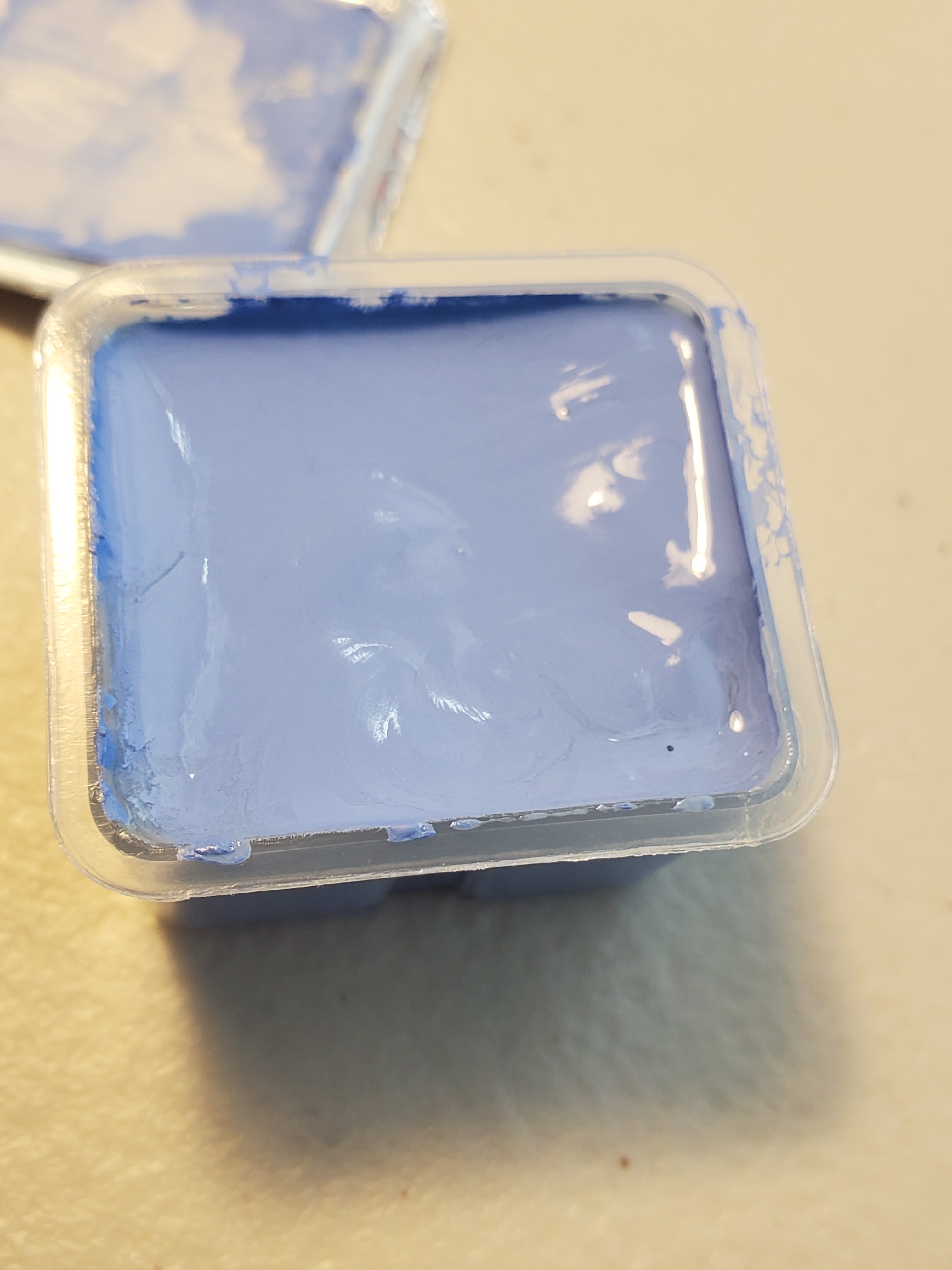
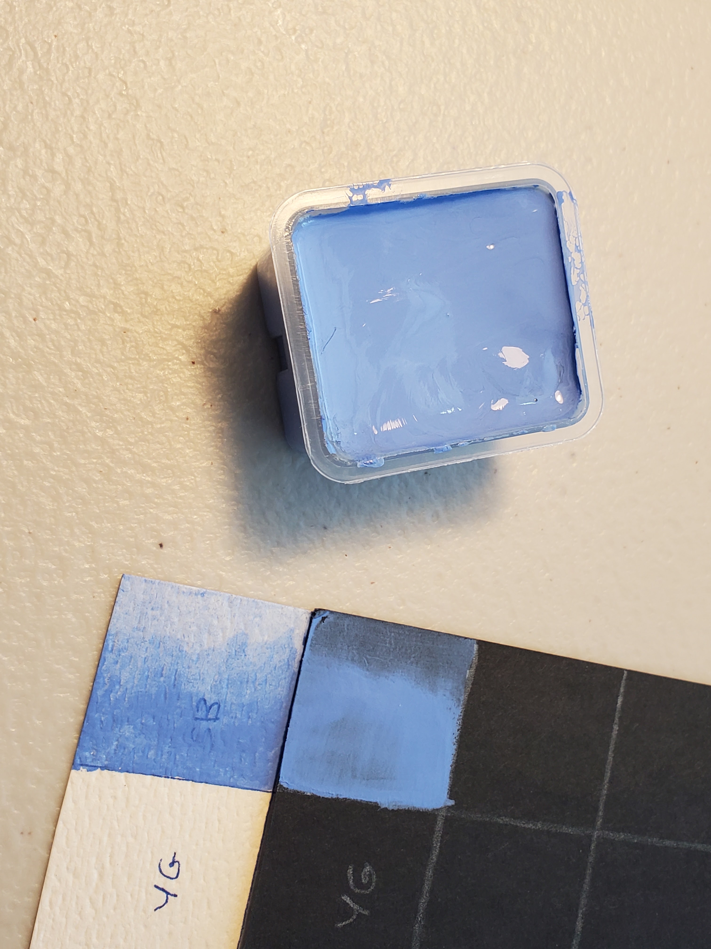
Showing posts with label gouache. Show all posts

Friday, May 8, 2026

Miya HIMI Jelly Gouache Color Review #7: Black and Nude

Goodness, it's been a while since I made a post on this. My apologies to those of you who have been waiting in real time for the final post in this series (although if you followed my page on Facebook, I'm sure you saw the finished painting quite some time ago). 

This is the seventh in a series of reviews of the individual colors from the Miya HIMI brand 24-color “jelly” gouache paint set. This review will concentrate on the Miya HIMI Black and Nude jelly gouache paint colors and will also include updates on my Star Trek painting and how my swatch chart is coming along.

Miya HIMI Jelly Gouache color Black


Last time, I painted Captain Picard's uniform tunic, using Deep Red for the shadow areas and Ponceau to balance out the bright, neutral red. I needed to paint the black part of Picard's tunic, and I decided to paint his horse body in a grey Appaloosa style, both to match his grey hair (he has some hair!) and to contrast with Kirk's golden brown satyr body. It also coordinated nicely with his tunic, like Kirk's coloration coordinated with his. I used the Black and White colors to do this and also to paint Kirk's horns and hooves so they would stand out more from his hair and furry legs. 


The Black swatched out with a high opacity and medium granularity on the black and white charts.   


Miya HIMI Jelly Gouache color Nude


I chose to paint the faces and hands of Kirk and Picard before painting their instruments, which were in front of their mouths (as we've learned through this series, I always start in the background and go forward, even when it gets granular, like this). 


The Nude had medium opacity and granularity on the black and white swatch charts. 


The Nude color was quite pale. Suitable for Patrick Stewart's British pallor (or should I say pallour), but I did need to mix in a little of the previously-opened Burnt Umber and a smidge of Ponceau to paint that tan Canadian, Shatner. 

I used some of the more tan color for Picard's lips and cheeks. After that, I was able to paint Kirk's pan flute with the Umber and Earth Yellow. I painted Picard's flute and added details with White, like the Captain's rank (four dots) on his collar and the "silver" background of his communicator badge. With these finishing touches, the painting was complete! 


I must say, it has been a real pleasure working with the Miya HIMI Jelly Gouache. It's very easy to use and to reactivate when dry. The colors mix well and it applies evenly. Of course, the colors dry either lighter or darker than you'd expect, but that's gouache for you. That's why we make swatch charts! 

For the original post describing the unboxing of the Miya HIMI jelly gouache paint set, go here: https://allsortsartbyali.blogspot.com/2023/03/unboxing-himi-jelly-gouache-24-color-set.html


For regular shenanigans, please follow my Facebook page, https://www.facebook.com/allsortsofart

Sunday, July 27, 2025

Miya HIMI Jelly Gouache Color Review #6: Deep Red and Ponceau


This is the sixth in a series of reviews of the individual colors from the Miya HIMI brand 24-color “jelly” gouache paint set. This review will concentrate on the Miya HIMI Deep Red and Ponceau jelly gouache paint colors and will also include updates on my Star Trek painting and how my swatch chart is coming along.


Miya HIMI Jelly Gouache color Deep Red

Last time, I painted Captain Kirk's yellow uniform jacket, and now it was time to do Captain Picard's tunic. Judging the colors by how they showed through the unopened containers, I thought the color called Ponceau was too light and orangey for Picard's uniform, so I opened Deep Red to see what I could see. As you'd imagine from the name, it's somewhat dark, but it's also a very cool red that I would liken to Alizarin Crimson.


To me, Picard's jacket is a very neutral red, neither extremely warm nor cool. Since lightening a cool red gives a rosy pink, I was definitely going to need Ponceau, as well. Cool colors are nice for shadows, though, so I used the Deep Red for the darker areas on Picard's uniform jacket.


As you can see from the white swatch chart, the granularity of this color is quite high, and the opacity ain't no great shakes.


Miya HIMI Jelly Gouache color Ponceau


Ponceau is a color name that I have never heard before, but this one would go in the Cadmium Red (warm red) slot in your color palette. It's very warm, but not quite as orange-y as I'd feared. It made a good foil to the Deep Red and kept Picard's tunic very balanced, overall.


As with the Deep Red, the granularity was high and opacity was pretty wimpy. That said, I didn't feel like I had to glob it on to get sufficient coverage for the painting. I might be singing a different tune if I weren't working on a medium-value brown background, though.


One more review to go to have this Renaissance/Classical Mythology/Star Trek extravaganza finished. Stay tuned!


For the original post describing the unboxing of the Miya HIMI jelly gouache paint set, go here: https://allsortsartbyali.blogspot.com/2023/03/unboxing-himi-jelly-gouache-24-color-set.html


For the first review in the series, go here: https://allsortsartbyali.blogspot.com/2023/06/himi-jelly-gouache-color-review-1-sky.html


For regular shenanigans, please follow my Facebook page, https://www.facebook.com/allsortsofart


Wednesday, July 2, 2025

Basic Information about Gouache Paint


If you are unfamiliar with gouache (pronounced GWAHSH), it is typically described as an opaque watercolor, although when diluted with water, it can be used transparently, as well. As with traditional watercolor, it doesn't dry waterproof, so be aware that if you paint over it, you could activate the dried layer if you use enough water. This can be great, as it makes the colors blend easily and gives you the ability to soften edges and spread color. It can also be annoying, of course. Be careful not to get drips or spatters of water on the dried paint surface, as this can create spots.

The opacity enables you to use the paint on dark surfaces, though, which can create interesting results. I painted this nighttime scene of my bedroom with white gouache on black bristol board. I especially like the reflection of the edge of the pillow against the night-darkened window glass. That kind of effect would be harder to achieve with a different medium. 


Gouache paint dries matte, like that tempera paint you probably used in grade school. The two paints actually look very similar in their finished state, but tempera dries permanent and gouache is rewettable/reworkable, as we've discussed. The paints have different binders – traditionally, egg yolk for tempera and gum arabic for gouache. There is also a type of gouache called acrylic gouache that dries permanent, like acrylic paint. I prefer workable gouache, since I already work in acrylic and can use that if I want a more permanent finish. 

Gouache has been around for quite a long time, but it was considered more of a designers' medium (that is, more for advertising and design layout sketches than for finished pieces - even my painting above was just a tonal study for a larger piece). However, it's been getting a bit of a renaissance lately, via art YouTube channels, since it is colorful, fun, and easy to use. I have been getting back into it myself and really enjoying it! I bought myself a set of Miya's HIMI jelly gouache and am in the process of posting some reviews of it showing the different colors and a gouache painting in progress. 

For the initial unboxing: https://allsortsartbyali.blogspot.com/2023/03/unboxing-himi-jelly-gouache-24-color-set.html 

The reviews start here: https://allsortsartbyali.blogspot.com/2023/06/himi-jelly-gouache-color-review-1-sky.html

For regular shenanigans, please follow my Facebook page, https://www.facebook.com/allsortsofart


All images are copyrighted property of the author and cannot be used without written permission.

Friday, June 30, 2023

HIMI Jelly Gouache Color Review #1 – Sky Blue, Swatch Chart, and Star Trek Painting Project


Recently, I posted about receiving and unboxing the 24-color HIMI gouache set. https://allsortsartbyali.blogspot.com/2023/03/unboxing-himi-jelly-gouache-24-color-set.html 


I am a planner, so before I opened any of the colors, I planned out a fairly involved set of swatch charts to show how the colors would look on light grounds and dark grounds, as well as on more-absorbent and less-absorbent surfaces. I used white watercolor paper as a light, highly-absorbent surface, and black bristol board (Strathmore Artagain) as a dark, less absorbent surface. Each chart actually has four pages, as I wanted to show how each color mixed with the others, but Page One, pictured, shows how the colors look in the palette before going into the mixing charts. Although you don't have to go to the lengths of making a chart to show all the mixes (and mine only shows 50/50 mixes of each color with one other color), it's recommended to at least make a basic swatch chart for your colors, as gouache tends to dry lighter or darker. 


To save time and materials, I decided to make my swatch chart concurrent with a painting project that would use a good variety of colors. A friend of mine had expressed a fanciful desire to see a Renaissance-style painting based on Star Trek characters, with Captain Kirk as a satyr, playing a pan flute, and Captain Picard as a centaur, playing the flute played by his character in an episode of Star Trek: Next Generation. This struck me as fun, so I made some sketches for the design, which would be incorporated into a birthday card design for her. I transferred the design to a kraft-paper card stock, and I plan to open each color in order as I needed it, adding it to my swatch chart and using it in my painting. 


HIMI Jelly Gouache color number 049- Sky Blue 

As you probably know if you've read my painting tutorial https://allsortsartbyali.blogspot.com/2015/09/step-by-step-painting-fantastic-mr-foxs.html , I like to start from the background and work forward. I decided to show my satyr and centaur frolicking in a pastoral setting typical of Renaissance work. Planning for a sunny meadow scene, I would first need a blue sky with some fluffy clouds. One of the colors is named Sky Blue, so that was clearly a no-brainer to open first.


It's no surprise to see it be a little messy at first; having sat for a while since it was filled up, the pigment and binder had separated a bit. However, a thorough mix brought it to a smooth, pudding-like consistency. I added it to my swatch charts, first as a whole-strength color on the “palette chart” section of the chart (that's the section on Page One that shows the colors all together as I have them arranged in my physical palette) to establish the base color and to check the opacity. Then I filled in the home slots on the color mixing section as a gradation, to check for granularity and transparency. In those sections, all the mixes will appear as gradations. 


The Sky Blue applied smoothly and mixed with water easily to create a transparent wash with very minimal granularity. So far, so good, except that this “sky blue” is far too warm to be an accurate representation of actual blue sky, except perhaps at sunrise or sunset. It's a lovely color, but it's really more of a periwinkle blue. A good, sunny sky needs something more like cerulean. Alas, I couldn't start on my painting, yet, but I found my groove with the next two colors. For that, go here: https://allsortsartbyali.blogspot.com/2023/07/himi-jelly-gouache-color-review-white.html

For regular shenanigans, please follow my Facebook page, https://www.facebook.com/allsortsofart


Friday, March 3, 2023

Unboxing the HIMI Jelly Gouache 24-Color Set


Full disclosure: I haven't used gouache since art school, although I do have fond memories of it. But gouache painting has recently come back into vogue, thanks in large part to “art YouTube”, and I was reminded of how much fun it was. I have been seeing a lot of art vloggers rave about the so-called “jelly gouache” produced in China by the Miya company under the HIMI brand name. I decided to order my own set to see what all the fuss is about.

The 24-color HIMI set is very popular and very easy to find from Amazon, Wal-Mart, and other retailers for about $30. It's an extremely good buy, considering that you get a generous amount of each color, packaged with a mixing palette and a set of three gouache brushes all in a securely-fastening carrying case. The case is available in several different colors. I chose the bright orange so that it would be very easy to locate when stored among my supplies. The tangerine-colored heavy plastic case also coordinates well with one of the tumblers I use to hold supplies, as seen here. What's not to like?


The case has flip-up tabs in the front and back that hold the lid securely on. Once it's removed, it can be placed beneath the tray to keep everything together. The mixing palette sits atop the tray, and within the tray sit the 24 “jelly cups” of gouache, along with a set of brushes in a plastic bag with a ridiculously cute little suit-wearing bird design.


When the gouache is unopened, it presents a pretty bland display, as the peel-off tops are opaque white. The color names and numbers are printed on the tops, but many of the color names might not be easy to visualize. Ultramarine Blue, Burnt Umber, and Black are no problem, but Ponceau (similar to Cadmium Red) and Acid Blue (similar to Cerulean or Pthalo Blue) aren't such familiar names. My theory is that they are substitutes for colors with more expensive pigments (Cadmiun Yellow is also not present), but there is a Cobalt Blue, so I'm not sure what to tell you (other than do not eat it). [Editing note - I see from the listing that this gouache is actually non-toxic, so less worry about eating it, but that also tells me the Cobalt Blue is probably not made with actual cobalt, which is lightly radioactive.]


Fortunately, the plastic cup itself is clear, so to see the colors, simply turn them over. Ponceau and Jade Green are the colors pictured here.


As a matter of fact, I would highly recommend flipping all of the colors over straightaway so that you can arrange them in the tray as you want. If you just start peeling the tops off the colors all willy-nilly, you may realize that you don't like the way the colors are arranged and will then have to try to pry the now-open cups out of the tray (they fit rather snugly) without getting paint all over yourself and the other paint.

I've arranged my colors, but I won't be opening them willy-nilly. I plan to be methodical about the whole operation, making sure to record the color names and numbers (for re-ordering purposes, in case I run out) and creating a big ol' swatch chart to show what the colors look like both on a white background and on a black background (fun fact – gouache does not dry the same color as it looks wet – it may dry lighter OR darker) and mixed with one another, so stay tuned for further posts about that fun project, which will also include individual color reviews.


Image credit: my photographs. May not use without permission.