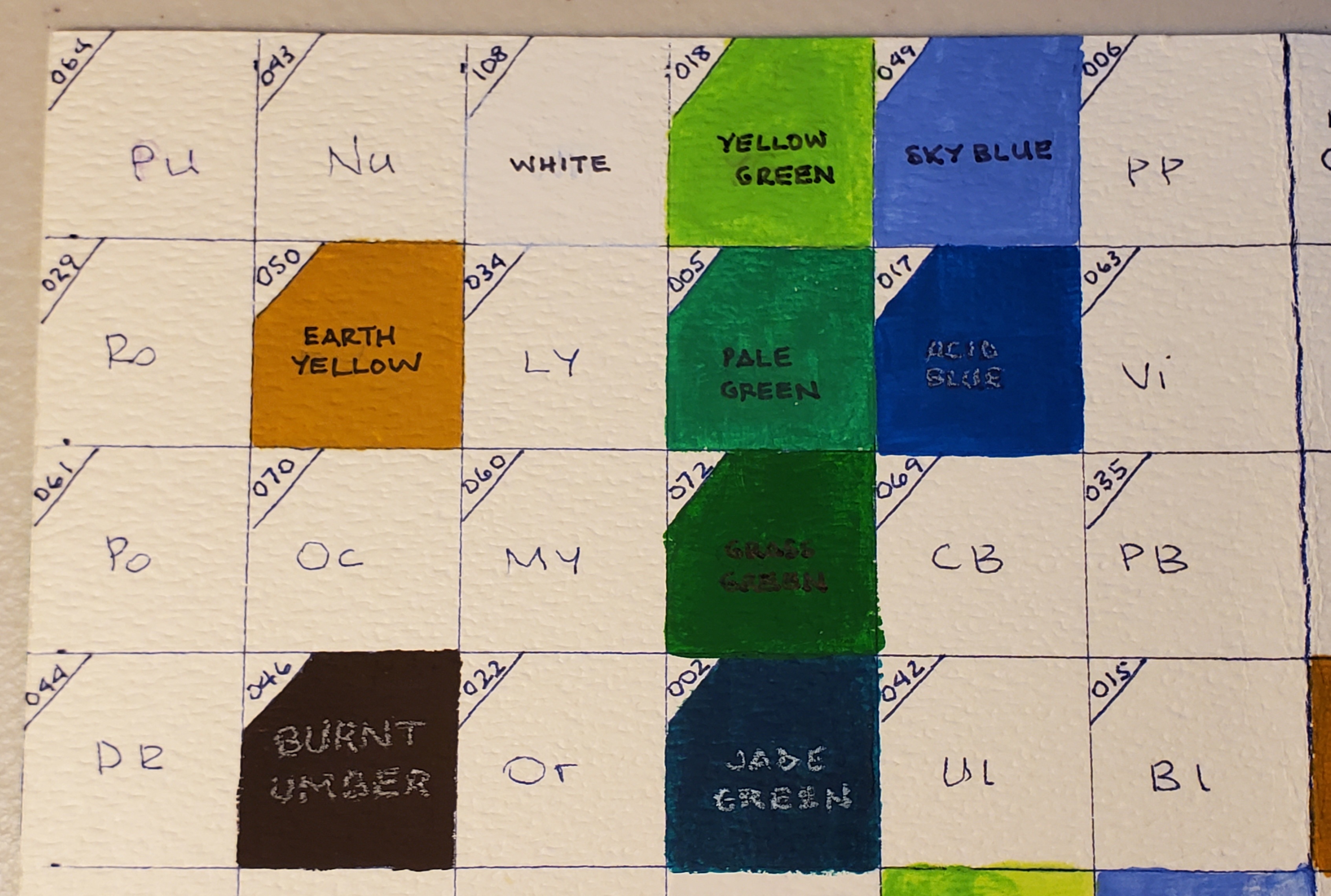
Showing posts with label HIMI gouache. Show all posts

Friday, May 8, 2026

Miya HIMI Jelly Gouache Color Review #7: Black and Nude

Goodness, it's been a while since I made a post on this. My apologies to those of you who have been waiting in real time for the final post in this series (although if you followed my page on Facebook, I'm sure you saw the finished painting quite some time ago). 

This is the seventh in a series of reviews of the individual colors from the Miya HIMI brand 24-color “jelly” gouache paint set. This review will concentrate on the Miya HIMI Black and Nude jelly gouache paint colors and will also include updates on my Star Trek painting and how my swatch chart is coming along.

Miya HIMI Jelly Gouache color Black


Last time, I painted Captain Picard's uniform tunic, using Deep Red for the shadow areas and Ponceau to balance out the bright, neutral red. I needed to paint the black part of Picard's tunic, and I decided to paint his horse body in a grey Appaloosa style, both to match his grey hair (he has some hair!) and to contrast with Kirk's golden brown satyr body. It also coordinated nicely with his tunic, like Kirk's coloration coordinated with his. I used the Black and White colors to do this and also to paint Kirk's horns and hooves so they would stand out more from his hair and furry legs. 


The Black swatched out with a high opacity and medium granularity on the black and white charts.   


Miya HIMI Jelly Gouache color Nude


I chose to paint the faces and hands of Kirk and Picard before painting their instruments, which were in front of their mouths (as we've learned through this series, I always start in the background and go forward, even when it gets granular, like this). 


The Nude had medium opacity and granularity on the black and white swatch charts. 


The Nude color was quite pale. Suitable for Patrick Stewart's British pallor (or should I say pallour), but I did need to mix in a little of the previously-opened Burnt Umber and a smidge of Ponceau to paint that tan Canadian, Shatner. 

I used some of the more tan color for Picard's lips and cheeks. After that, I was able to paint Kirk's pan flute with the Umber and Earth Yellow. I painted Picard's flute and added details with White, like the Captain's rank (four dots) on his collar and the "silver" background of his communicator badge. With these finishing touches, the painting was complete! 


I must say, it has been a real pleasure working with the Miya HIMI Jelly Gouache. It's very easy to use and to reactivate when dry. The colors mix well and it applies evenly. Of course, the colors dry either lighter or darker than you'd expect, but that's gouache for you. That's why we make swatch charts! 

For the original post describing the unboxing of the Miya HIMI jelly gouache paint set, go here: https://allsortsartbyali.blogspot.com/2023/03/unboxing-himi-jelly-gouache-24-color-set.html


For regular shenanigans, please follow my Facebook page, https://www.facebook.com/allsortsofart

Sunday, July 27, 2025

Miya HIMI Jelly Gouache Color Review #6: Deep Red and Ponceau


This is the sixth in a series of reviews of the individual colors from the Miya HIMI brand 24-color “jelly” gouache paint set. This review will concentrate on the Miya HIMI Deep Red and Ponceau jelly gouache paint colors and will also include updates on my Star Trek painting and how my swatch chart is coming along.


Miya HIMI Jelly Gouache color Deep Red

Last time, I painted Captain Kirk's yellow uniform jacket, and now it was time to do Captain Picard's tunic. Judging the colors by how they showed through the unopened containers, I thought the color called Ponceau was too light and orangey for Picard's uniform, so I opened Deep Red to see what I could see. As you'd imagine from the name, it's somewhat dark, but it's also a very cool red that I would liken to Alizarin Crimson.


To me, Picard's jacket is a very neutral red, neither extremely warm nor cool. Since lightening a cool red gives a rosy pink, I was definitely going to need Ponceau, as well. Cool colors are nice for shadows, though, so I used the Deep Red for the darker areas on Picard's uniform jacket.


As you can see from the white swatch chart, the granularity of this color is quite high, and the opacity ain't no great shakes.


Miya HIMI Jelly Gouache color Ponceau


Ponceau is a color name that I have never heard before, but this one would go in the Cadmium Red (warm red) slot in your color palette. It's very warm, but not quite as orange-y as I'd feared. It made a good foil to the Deep Red and kept Picard's tunic very balanced, overall.


As with the Deep Red, the granularity was high and opacity was pretty wimpy. That said, I didn't feel like I had to glob it on to get sufficient coverage for the painting. I might be singing a different tune if I weren't working on a medium-value brown background, though.


One more review to go to have this Renaissance/Classical Mythology/Star Trek extravaganza finished. Stay tuned!


For the original post describing the unboxing of the Miya HIMI jelly gouache paint set, go here: https://allsortsartbyali.blogspot.com/2023/03/unboxing-himi-jelly-gouache-24-color-set.html


For the first review in the series, go here: https://allsortsartbyali.blogspot.com/2023/06/himi-jelly-gouache-color-review-1-sky.html


For regular shenanigans, please follow my Facebook page, https://www.facebook.com/allsortsofart


Wednesday, July 2, 2025

Basic Information about Gouache Paint


If you are unfamiliar with gouache (pronounced GWAHSH), it is typically described as an opaque watercolor, although when diluted with water, it can be used transparently, as well. As with traditional watercolor, it doesn't dry waterproof, so be aware that if you paint over it, you could activate the dried layer if you use enough water. This can be great, as it makes the colors blend easily and gives you the ability to soften edges and spread color. It can also be annoying, of course. Be careful not to get drips or spatters of water on the dried paint surface, as this can create spots.

The opacity enables you to use the paint on dark surfaces, though, which can create interesting results. I painted this nighttime scene of my bedroom with white gouache on black bristol board. I especially like the reflection of the edge of the pillow against the night-darkened window glass. That kind of effect would be harder to achieve with a different medium. 


Gouache paint dries matte, like that tempera paint you probably used in grade school. The two paints actually look very similar in their finished state, but tempera dries permanent and gouache is rewettable/reworkable, as we've discussed. The paints have different binders – traditionally, egg yolk for tempera and gum arabic for gouache. There is also a type of gouache called acrylic gouache that dries permanent, like acrylic paint. I prefer workable gouache, since I already work in acrylic and can use that if I want a more permanent finish. 

Gouache has been around for quite a long time, but it was considered more of a designers' medium (that is, more for advertising and design layout sketches than for finished pieces - even my painting above was just a tonal study for a larger piece). However, it's been getting a bit of a renaissance lately, via art YouTube channels, since it is colorful, fun, and easy to use. I have been getting back into it myself and really enjoying it! I bought myself a set of Miya's HIMI jelly gouache and am in the process of posting some reviews of it showing the different colors and a gouache painting in progress. 

For the initial unboxing: https://allsortsartbyali.blogspot.com/2023/03/unboxing-himi-jelly-gouache-24-color-set.html 

The reviews start here: https://allsortsartbyali.blogspot.com/2023/06/himi-jelly-gouache-color-review-1-sky.html

For regular shenanigans, please follow my Facebook page, https://www.facebook.com/allsortsofart


All images are copyrighted property of the author and cannot be used without written permission.

Sunday, June 1, 2025

Miya HIMI Jelly Gouache Color Review #5: Earth Yellow and Burnt Umber


This is the fifth in a series of reviews of the individual colors from the Miya HIMI brand 24-color “jelly” gouache paint set. This review will concentrate on the Miya HIMI Earth Yellow and Burnt Umber jelly gouache paint colors and will also include updates on my Star Trek painting and how my swatch chart is coming along. (The previous review can be found here:

 https://allsortsartbyali.blogspot.com/2024/04/himi-jelly-gouache-color-review-4-jade.html )


Miya HIMI Jelly Gouache color Earth Yellow 050


With the background finished, it was time to start on my figures. Animal bits aside, this was still Kirk and Picard, so I needed to ensure they were recognizable. The easiest way to do that was by including their uniform jackets. Despite the whole green/gold controversy surrounding Kirk's uniform, I always saw it as gold, so I needed a yellow ochre-ish color. The HIMI set has a color called Earth Yellow that is the right shade, so I busted that out and swatched it, then painted the base color of Kirk's jacket. It was a very straightforward match – no color-mixing necessary. 


As you can see from the swatches, Earth Yellow has a strong opacity with some marked granularity, typical of earth tones.


Miya HIMI Jelly Gouache color Burnt Umber 046


Next, I needed a brown color for Kirk's goaty lower body. I also needed to mix a shadow color for his jacket and some brown for his hair. Burnt Umber, a slightly cool, dark brown, blended well with the Earth Yellow gouache to create a neutral, mid-range brown to create the shading on Kirk's jacket and his brown hair. 


Then I flipped the script and used the Earth Yellow to create highlighted areas on Kirk's satyr legs and hair. The colors mix very well and application was smooth, as with the prior colors. 


The Burnt Umber was a lovely chocolate pudding color – very tempting! As with its fellow earth color, Earth Yellow, the Burnt Umber had strong opacity and granularity. These are also probably the most lightfast hues in the collection, another feature of earth tones.


A look at the swatch chart shows several of the color mixes as well as the comparison of the lighter and darker and warmer and cooler colors. I've only done a few 50/50 mixes so far, as I was focusing more on getting the painting done for my friend's birthday, but I did swatch a mix of the Earth Yellow and Burt Umber, which appears halfway down the right edge, where the two colors converge on the grid. As you can see, it makes a lovely golden brown. 


The birthday card was starting to take shape - as you can see above, I filled in the lettering, since the background was complete. 


Next review can be found here: https://allsortsartbyali.blogspot.com/2025/07/miya-himi-jelly-gouache-color-review-6.html

For the original post describing the unboxing of the Miya HIMI jelly gouache paint set, go here: https://allsortsartbyali.blogspot.com/2023/03/unboxing-himi-jelly-gouache-24-color-set.html

For the first review in the series and an explanation of the painting and its very particular subject matter, go here: https://allsortsartbyali.blogspot.com/2023/06/himi-jelly-gouache-color-review-1-sky.html


For regular shenanigans, please follow my Facebook page, https://www.facebook.com/allsortsofart


Saturday, April 6, 2024

HIMI Jelly Gouache Color Review #4: Jade Green, Grass Green, and Yellow Green


This is the fourth in a series of reviews of the individual colors from the HIMI brand 24-color “jelly” gouache paint set. This review will concentrate on the HIMI Jade Green, Grass Green, and Yellow Green jelly gouache paint colors and will also include updates on my Star Trek painting and how my swatch chart is coming along.

Setting aside the mint green grass debacle (see the review of HIMI Gouache color 005 – Pale Green for that https://allsortsartbyali.blogspot.com/2023/09/himi-jelly-gouache-color-review-3-pale.html) for a while, I turned back to working on the background of the painting. I needed a line of trees in the background, and so I was looking for a green that was darker but very cool, since cool colors recede.


HIMI Jelly Gouache color no 002 – Jade Green


There was a color in the collection called Jade Green - this is HIMI gouache color 002. It is a very dark color with a very cool cast, kind of like the green version of the Acid Blue that I discussed in a previous post (https://allsortsartbyali.blogspot.com/2023/07/himi-jelly-gouache-color-review-white.html). 

As with the other colors, it was very creamy in consistency once I had given it a good stir to get it well-blended. It was very dark, but gouache is easily lightened by diluting it with water or by mixing it with white or lighter colors. Since this was for the background and it's best to work thin-to-thick, I chose to simply dilute with water for the lighter bits. It made a good color for the background trees, so I went ahead and painted in the treeline and then added the Jade Green to my swatch charts.


HIMI Jelly Gouache color no 072 – Grass Green


Now that the trees were established in the background, I went back to working on the grass to complete the background of the picture. The obvious choice at this point was Grass Green, at which I had turned up my nose before. Not surprisingly, it ended up being an appropriate color for the grass, as you can see in this picture.


HIMI Jelly Gouache color no 018 – Yellow Green


I also added the color Yellow Green to highlight the areas where the sun would naturally be striking the grass, so that I could have a nice sunny meadow to compliment my bright blue sky. As you can see from the swatch chart at the top of the page, the Grass Green and the Yellow Green are extremely warm - that is, they have a lot of yellow in them - in contrast to the Jade Green and the Pale Green colors, which are extremely cool, meaning that they have a very blue undertone.

Now the background of the picture is pretty much complete, and I can move along to painting my characters!


For the original post describing the unboxing of the HIMI jelly gouache paint set, go here: https://allsortsartbyali.blogspot.com/2023/03/unboxing-himi-jelly-gouache-24-color-set.html


For the first review in the series, go here: https://allsortsartbyali.blogspot.com/2023/06/himi-jelly-gouache-color-review-1-sky.html


For regular shenanigans, please follow my Facebook page, https://www.facebook.com/allsortsofart


Saturday, September 16, 2023

HIMI Jelly Gouache Color Review #3: Pale Green


This is the third in a series of reviews of the individual colors from the HIMI brand 24-color “jelly” gouache paint set. This review will concentrate on the Pale Green jelly gouache color and will also include updates on my Star Trek painting and how my swatch chart is coming along and how the gouache set is holding up.

In previous reviews, I described my swatch charts and how I would be reviewing the HIMI gouache colors as I opened each one up to use in a small painting with a mythology/Star Trek theme done on a birthday card for a friend. The painting is an outdoor scene, and I paint back-to-front, so the first order of business would be establishing the thing that is ultimately the most background-y thing in a landscape: the sky. After HIMI's Sky Blue color turned out not to be what seemed like a softball (here's that experience: https://allsortsartbyali.blogspot.com/2023/06/himi-jelly-gouache-color-review-1-sky.html), I was able to make a decent sky out of Acid Blue (who knew?) and, of course, white. Details here, if you haven't seen that one: https://allsortsartbyali.blogspot.com/2023/07/himi-jelly-gouache-color-review-white.html

Now, the search is on for an appropriate color for the grassy meadow. There is literally a color in the set called Grass Green, but I wasn't going to be fooled again. In my wisdom (or maybe just cynicism), I started with Pale Green, a much less intense color. What the heck, I figured – it's easy enough to paint over. The swatch chart is not gonna fill itself.


HIMI Jelly Gouache color number 005- Pale Green


So, Pale Green is EXACTLY AS ADVERTISED. It's pale green. It's actually pretty much – at least it appears on the brown kraft-paper card – a mint green. Lovely color; not very grassy. Anyway, I painted the whole meadow anyway, so that when I painted over it, the color would be consistent. This ain't my first rodeo, y'all.


I swatched out Pale Green on my black and white charts by itself and also mixed 50/50 with White, Sky Blue and Acid Blue. 


It makes a nice emerald color when mixed with the Acid Blue. The Sky Blue didn't affect it much other than cooling it a bit. The White, predictably, just made it very minty. The opacity of this color is very impressive, and the granularity is very low. It's a smooth color, just not very grassy. Oh, well! Live and learn.


Here are the first four colors as I have them arranged in my set (picture was taken before swatching).


The Acid Blue is still a bit creamy, but the Sky Blue and the White have dried out a bit. Never fear! These paints aren't like acrylics – they don't dry waterproof. All it takes to revive them is a bit of water. You can drip clean water off your paintbrush, or if you would like to revive several, or all, of them, a little spray bottle does the trick nicely. I got this one from the dollar store. It works well, and it's super cute!


Next up, we'll see if Grass Green wasn't lying to me like Sky Blue did. 

https://allsortsartbyali.blogspot.com/2024/04/himi-jelly-gouache-color-review-4-jade.html

Here is the first article regarding the unboxing and the overall quality and appearance of the 24-color HIMI jelly gouache set:

https://allsortsartbyali.blogspot.com/2023/03/unboxing-himi-jelly-gouache-24-color-set.html

For regular shenanigans, please follow my Facebook page, https://www.facebook.com/allsortsofart


Saturday, July 22, 2023

HIMI Jelly Gouache Color Review: White, Acid Blue


In the prior review https://allsortsartbyali.blogspot.com/2023/06/himi-jelly-gouache-color-review-1-sky.html,  I described my swatch charts and how I would be reviewing the HIMI gouache colors as I opened each one up to use in a small painting with a mythology/Star Trek theme done on a birthday card for a friend. The painting is an outdoor scene, and I wanted to start with the sky, but alas, Sky Blue turned out to be a bit too purpley - more of a periwinkle color (see above pic). Knowing that Ultramarine and Cobalt would also likely be too warm, I turned my attention to the blue that was most like Cerulean, called Acid Blue. It was very dark in the jelly cup, so I knew I would need White, as well. 


HIMI Jelly Gouache color number 108- White 


I opened the White first and swatched it in beside Sky Blue on my charts. Of course, you can't tell much from the white charts, but it had pretty decent opacity on the black charts and no granularity to speak of. It appears to be a good neutral white, with no hint of cream or grey that might skew it warm or cool. I mixed equal parts of the White with the previously-opened Sky Blue to create my first mix at the appropriate intersection on my swatch charts. It created a nice pale lavender.  


HIMI Jelly Gouache color number 017- Acid Blue 


Acid Blue isn't a typical color name, but I would liken this to cerulean, or perhaps phthalo blue. As with the other colors, it stirred up to a smooth, pudding-type consistency (not like a jelly, as the name implies) and applied smoothly to the swatch charts. The Acid Blue had good opacity and minimal granularity when diluted. When mixed with the White, it made a good sky color (middle). It also made a nice turquoise when mixed with the Sky Blue (right). Yay! I was able to start on the card. 


I laid in the sky and then used the White to indicate some clouds. With gouache, as with other paints, it's best to work lean-to-fat, so I started with a thinner wash, which I built up where I needed to. As you can see, the brown of the kraft paper shows through somewhat in some areas of the wash. I built up the wash to be more opaque in most areas, but I did leave some of this slight brownish tint showing, as I liked the aging effect. This was a conscious design decision by me and shouldn't be taken as an evaluation of the paint's coverage. 


The thing about gouache is that it's flexible - like traditional transparent watercolors, you can use varying degrees of dilution to control intensity, but unlike transparent watercolors, you can control the opacity, as well. Being able to go back in and rework the paint is very handy as, as well. I was able to go back in with just a wet brush to smooth out a couple of spots, and once the gouache dried, I was able to evaluate the respective values and add volume to the clouds with a heavier application of the White to add thicker-looking, highlighted areas. 

In the next post, I'll start the hunt for the right grass color! https://allsortsartbyali.blogspot.com/2023/09/himi-jelly-gouache-color-review-3-pale.html

Here is the first article regarding the unboxing and the overall quality and appearance of the 24-color HIMI jelly gouache set:

https://allsortsartbyali.blogspot.com/2023/03/unboxing-himi-jelly-gouache-24-color-set.html


For regular shenanigans, please follow my Facebook page, https://www.facebook.com/allsortsofart