Saturday, September 16, 2023

HIMI Jelly Gouache Color Review #3: Pale Green


This is the third in a series of reviews of the individual colors from the HIMI brand 24-color “jelly” gouache paint set. This review will concentrate on the Pale Green jelly gouache color and will also include updates on my Star Trek painting and how my swatch chart is coming along and how the gouache set is holding up.

In previous reviews, I described my swatch charts and how I would be reviewing the HIMI gouache colors as I opened each one up to use in a small painting with a mythology/Star Trek theme done on a birthday card for a friend. The painting is an outdoor scene, and I paint back-to-front, so the first order of business would be establishing the thing that is ultimately the most background-y thing in a landscape: the sky. After HIMI's Sky Blue color turned out not to be what seemed like a softball (here's that experience: https://allsortsartbyali.blogspot.com/2023/06/himi-jelly-gouache-color-review-1-sky.html), I was able to make a decent sky out of Acid Blue (who knew?) and, of course, white. Details here, if you haven't seen that one: https://allsortsartbyali.blogspot.com/2023/07/himi-jelly-gouache-color-review-white.html

Now, the search is on for an appropriate color for the grassy meadow. There is literally a color in the set called Grass Green, but I wasn't going to be fooled again. In my wisdom (or maybe just cynicism), I started with Pale Green, a much less intense color. What the heck, I figured – it's easy enough to paint over. The swatch chart is not gonna fill itself.


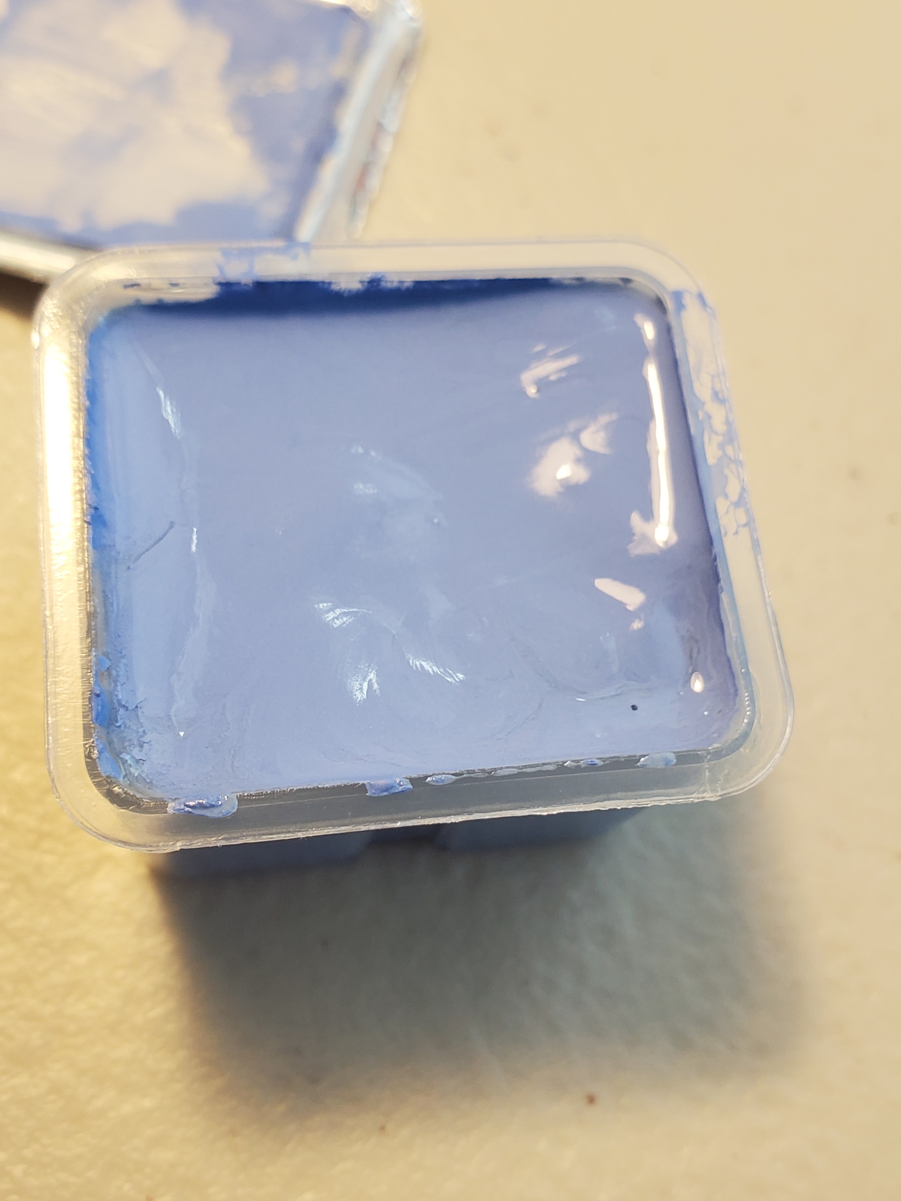
HIMI Jelly Gouache color number 005- Pale Green


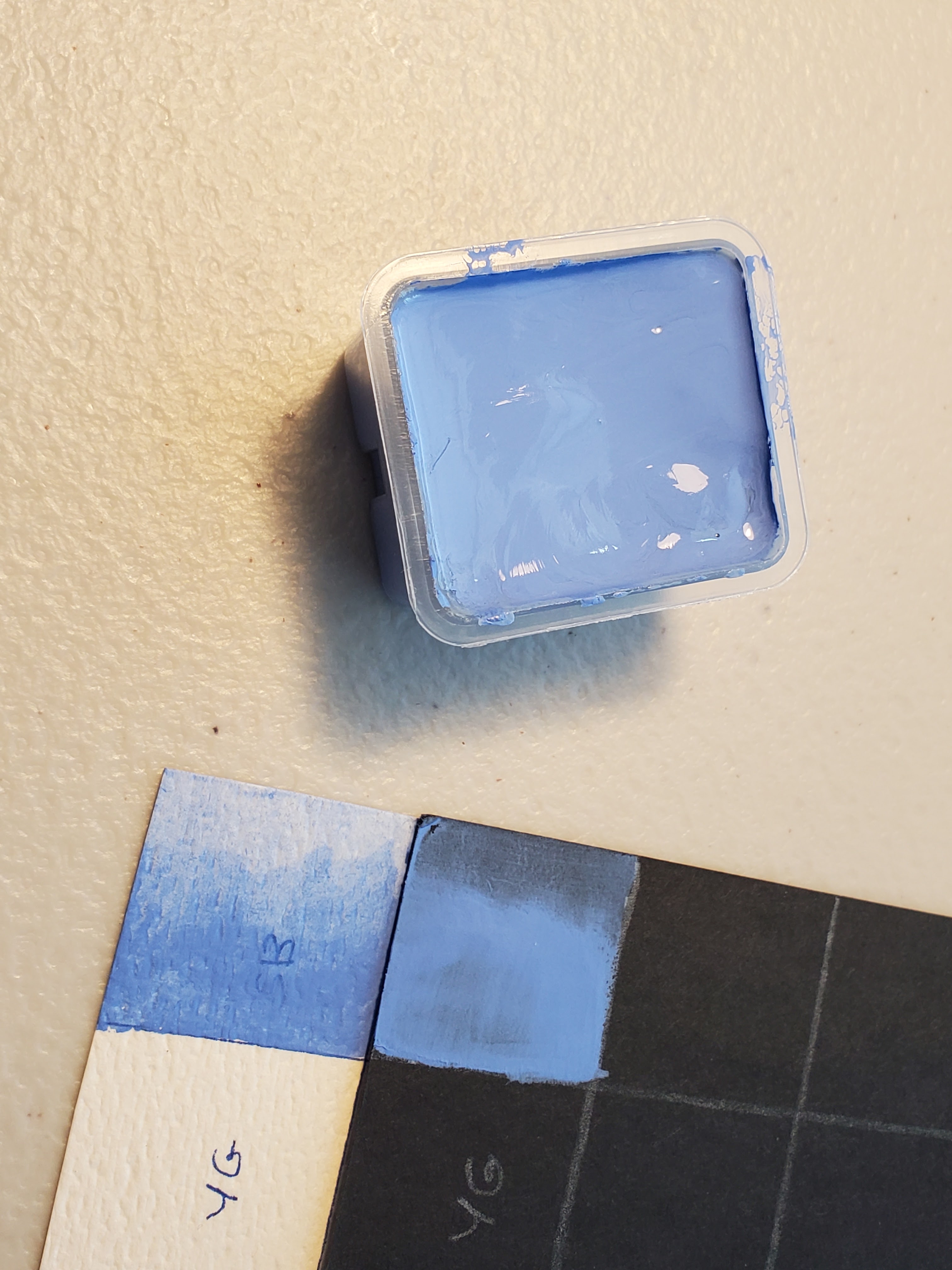
So, Pale Green is EXACTLY AS ADVERTISED. It's pale green. It's actually pretty much – at least it appears on the brown kraft-paper card – a mint green. Lovely color; not very grassy. Anyway, I painted the whole meadow anyway, so that when I painted over it, the color would be consistent. This ain't my first rodeo, y'all.


I swatched out Pale Green on my black and white charts by itself and also mixed 50/50 with White, Sky Blue and Acid Blue. 


It makes a nice emerald color when mixed with the Acid Blue. The Sky Blue didn't affect it much other than cooling it a bit. The White, predictably, just made it very minty. The opacity of this color is very impressive, and the granularity is very low. It's a smooth color, just not very grassy. Oh, well! Live and learn.


Here are the first four colors as I have them arranged in my set (picture was taken before swatching).


The Acid Blue is still a bit creamy, but the Sky Blue and the White have dried out a bit. Never fear! These paints aren't like acrylics – they don't dry waterproof. All it takes to revive them is a bit of water. You can drip clean water off your paintbrush, or if you would like to revive several, or all, of them, a little spray bottle does the trick nicely. I got this one from the dollar store. It works well, and it's super cute!


Next up, we'll see if Grass Green wasn't lying to me like Sky Blue did. 

https://allsortsartbyali.blogspot.com/2024/04/himi-jelly-gouache-color-review-4-jade.html

Here is the first article regarding the unboxing and the overall quality and appearance of the 24-color HIMI jelly gouache set:

https://allsortsartbyali.blogspot.com/2023/03/unboxing-himi-jelly-gouache-24-color-set.html

For regular shenanigans, please follow my Facebook page, https://www.facebook.com/allsortsofart


Saturday, July 22, 2023

HIMI Jelly Gouache Color Review: White, Acid Blue


In the prior review https://allsortsartbyali.blogspot.com/2023/06/himi-jelly-gouache-color-review-1-sky.html,  I described my swatch charts and how I would be reviewing the HIMI gouache colors as I opened each one up to use in a small painting with a mythology/Star Trek theme done on a birthday card for a friend. The painting is an outdoor scene, and I wanted to start with the sky, but alas, Sky Blue turned out to be a bit too purpley - more of a periwinkle color (see above pic). Knowing that Ultramarine and Cobalt would also likely be too warm, I turned my attention to the blue that was most like Cerulean, called Acid Blue. It was very dark in the jelly cup, so I knew I would need White, as well. 


HIMI Jelly Gouache color number 108- White 


I opened the White first and swatched it in beside Sky Blue on my charts. Of course, you can't tell much from the white charts, but it had pretty decent opacity on the black charts and no granularity to speak of. It appears to be a good neutral white, with no hint of cream or grey that might skew it warm or cool. I mixed equal parts of the White with the previously-opened Sky Blue to create my first mix at the appropriate intersection on my swatch charts. It created a nice pale lavender.  


HIMI Jelly Gouache color number 017- Acid Blue 


Acid Blue isn't a typical color name, but I would liken this to cerulean, or perhaps phthalo blue. As with the other colors, it stirred up to a smooth, pudding-type consistency (not like a jelly, as the name implies) and applied smoothly to the swatch charts. The Acid Blue had good opacity and minimal granularity when diluted. When mixed with the White, it made a good sky color (middle). It also made a nice turquoise when mixed with the Sky Blue (right). Yay! I was able to start on the card. 


I laid in the sky and then used the White to indicate some clouds. With gouache, as with other paints, it's best to work lean-to-fat, so I started with a thinner wash, which I built up where I needed to. As you can see, the brown of the kraft paper shows through somewhat in some areas of the wash. I built up the wash to be more opaque in most areas, but I did leave some of this slight brownish tint showing, as I liked the aging effect. This was a conscious design decision by me and shouldn't be taken as an evaluation of the paint's coverage. 


The thing about gouache is that it's flexible - like traditional transparent watercolors, you can use varying degrees of dilution to control intensity, but unlike transparent watercolors, you can control the opacity, as well. Being able to go back in and rework the paint is very handy as, as well. I was able to go back in with just a wet brush to smooth out a couple of spots, and once the gouache dried, I was able to evaluate the respective values and add volume to the clouds with a heavier application of the White to add thicker-looking, highlighted areas. 

In the next post, I'll start the hunt for the right grass color! https://allsortsartbyali.blogspot.com/2023/09/himi-jelly-gouache-color-review-3-pale.html

Here is the first article regarding the unboxing and the overall quality and appearance of the 24-color HIMI jelly gouache set:

https://allsortsartbyali.blogspot.com/2023/03/unboxing-himi-jelly-gouache-24-color-set.html


For regular shenanigans, please follow my Facebook page, https://www.facebook.com/allsortsofart 


Friday, June 30, 2023

HIMI Jelly Gouache Color Review #1 – Sky Blue, Swatch Chart, and Star Trek Painting Project


Recently, I posted about receiving and unboxing the 24-color HIMI gouache set. https://allsortsartbyali.blogspot.com/2023/03/unboxing-himi-jelly-gouache-24-color-set.html 


I am a planner, so before I opened any of the colors, I planned out a fairly involved set of swatch charts to show how the colors would look on light grounds and dark grounds, as well as on more-absorbent and less-absorbent surfaces. I used white watercolor paper as a light, highly-absorbent surface, and black bristol board (Strathmore Artagain) as a dark, less absorbent surface. Each chart actually has four pages, as I wanted to show how each color mixed with the others, but Page One, pictured, shows how the colors look in the palette before going into the mixing charts. Although you don't have to go to the lengths of making a chart to show all the mixes (and mine only shows 50/50 mixes of each color with one other color), it's recommended to at least make a basic swatch chart for your colors, as gouache tends to dry lighter or darker. 


To save time and materials, I decided to make my swatch chart concurrent with a painting project that would use a good variety of colors. A friend of mine had expressed a fanciful desire to see a Renaissance-style painting based on Star Trek characters, with Captain Kirk as a satyr, playing a pan flute, and Captain Picard as a centaur, playing the flute played by his character in an episode of Star Trek: Next Generation. This struck me as fun, so I made some sketches for the design, which would be incorporated into a birthday card design for her. I transferred the design to a kraft-paper card stock, and I plan to open each color in order as I needed it, adding it to my swatch chart and using it in my painting. 


HIMI Jelly Gouache color number 049- Sky Blue 

As you probably know if you've read my painting tutorial https://allsortsartbyali.blogspot.com/2015/09/step-by-step-painting-fantastic-mr-foxs.html , I like to start from the background and work forward. I decided to show my satyr and centaur frolicking in a pastoral setting typical of Renaissance work. Planning for a sunny meadow scene, I would first need a blue sky with some fluffy clouds. One of the colors is named Sky Blue, so that was clearly a no-brainer to open first.


It's no surprise to see it be a little messy at first; having sat for a while since it was filled up, the pigment and binder had separated a bit. However, a thorough mix brought it to a smooth, pudding-like consistency. I added it to my swatch charts, first as a whole-strength color on the “palette chart” section of the chart (that's the section on Page One that shows the colors all together as I have them arranged in my physical palette) to establish the base color and to check the opacity. Then I filled in the home slots on the color mixing section as a gradation, to check for granularity and transparency. In those sections, all the mixes will appear as gradations. 


The Sky Blue applied smoothly and mixed with water easily to create a transparent wash with very minimal granularity. So far, so good, except that this “sky blue” is far too warm to be an accurate representation of actual blue sky, except perhaps at sunrise or sunset. It's a lovely color, but it's really more of a periwinkle blue. A good, sunny sky needs something more like cerulean. Alas, I couldn't start on my painting, yet, but I found my groove with the next two colors. For that, go here: https://allsortsartbyali.blogspot.com/2023/07/himi-jelly-gouache-color-review-white.html

For regular shenanigans, please follow my Facebook page, https://www.facebook.com/allsortsofart


Sunday, June 11, 2023

Unboxing the Artownlar 72-Piece Art Supply Set


I was poking around at the new closeout store, where I had promised myself not to buy anything that I did not currently need or would not use on a regular basis. Rather than pawing through the bins like other people, I just kind of held back, strolling around slowly, waiting for something to catch my eye.

Well, the word “art” caught my eye. Sticking out of a jumble was a thick box labeled “Drawing Art Set – 72 pieces- Premium- Professional Art Supplies”. The brand name, “Artownlar” sounded like one of those nonsense names Chinese companies come up with based on a realllly loose knowledge of English, but hey, the first three letters had done exactly what they were supposed to do – get me to pick the box up and look it over. No-name brands are notorious for being crap, and cheap art supplies are also notorious for being crap, but it said 72 pieces, and it had some heft to it, so for the low, low price of $10, I was willing to take a gamble. After all, not all Chinese stuff is crap - the HIMI gouache paints have been superb!


The package was sealed, so I looked at the box for some hint of what was in it. I expected a photo or at least some details on the box, but all there was on the packaging besides the cover illustration was a blurb that described the contents as a " charcoal drawing set”. well, I highly doubted there were 72 pieces of charcoal in the box. Since there was a color illustration on the lid, I figured it was probably a set of pastels. 72 pastels for 10 bucks? Yes, please! I bought it.

When I got it back to the studio and opened it up, I got my first pleasant surprise: It came in a zippered set, along with a decently-sized pad of drawing paper. I haven't opened up the paper yet to check the quality (reviews to come!), but it does say 80 lb. That's extremely heartening, since sketchbook paper is typically about 65 lb. Heck, my favorite drawing paper, Strathmore 400 series, is 80 lb, so: cool. The pad has a standard amount of pages – 60 – mostly white, but some tan and some black.


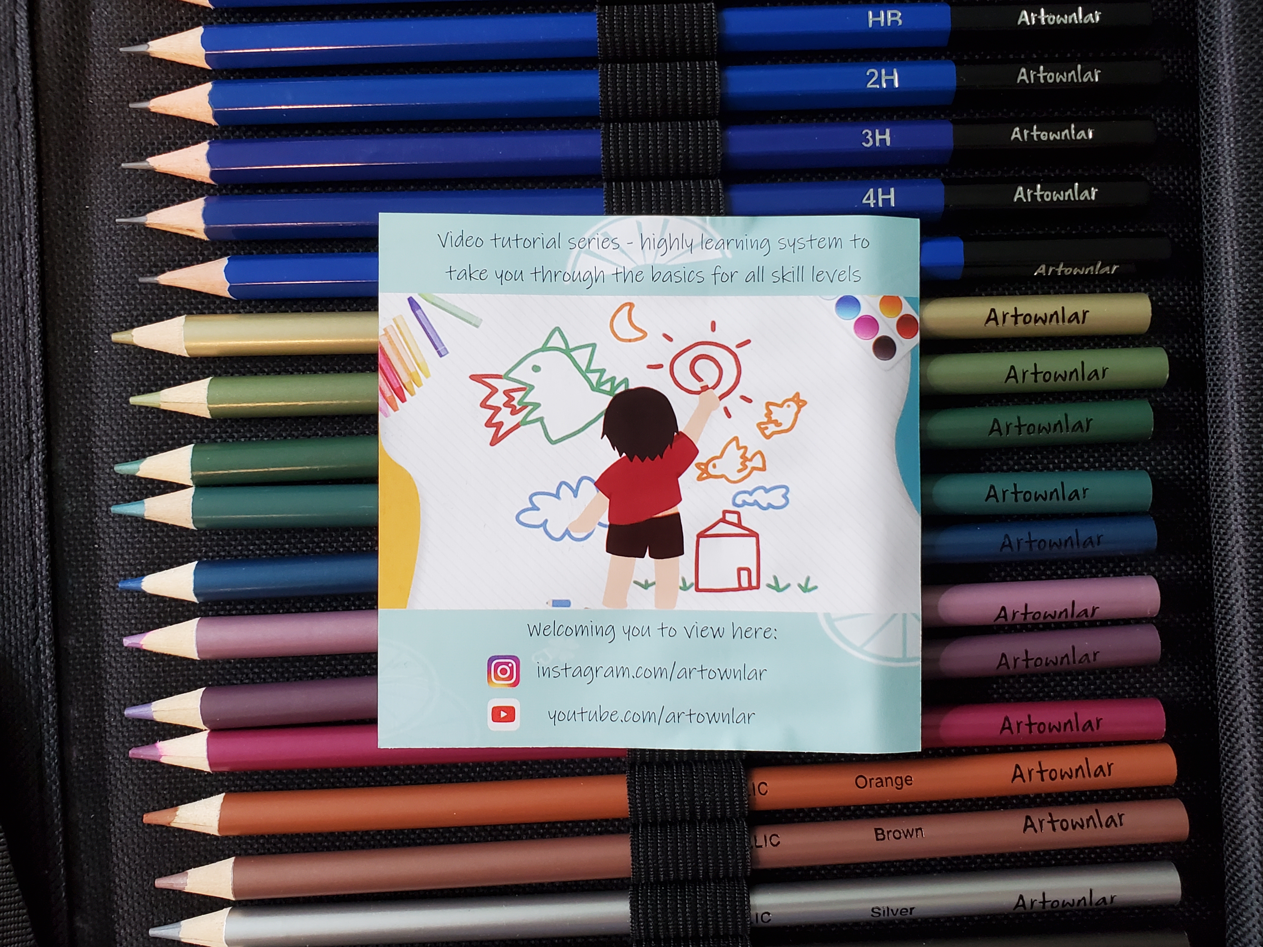
I opened the zippered case, and it's a trifold, just chock full of stuff. Not pastels, but several different kinds of pencils. And when I took photos for this article, I realized that if I had looked more closely at the bar code, I would have had a heads-up about that:


In the left-hand section, a set of charcoal pencils, some black and some white, plus three tortillons (blending stumps), a sandpaper block, a pencil sharpener, a white plastic eraser, and a kneaded eraser. That section right there is worth at least 10 bucks, as is the drawing pad (okay, maybe $8 for the pad, without knowing the quality). 


But wait, there's more! There's a set of regular colored pencils and a set of metallics, a set of watercolor pencils, and a water brush (plastic fillable brush - you squeeze a bit to let water flow through the brush part), and your basic range of drawing pencils. what a haul! Each of these three sections is worth what I paid for the whole thing, not even counting the drawing pad.


There is even some info regarding social media - and apparently some tutorial videos on YouTube - ah, cross-branding!--included. I haven't watched any videos, yet, but please feel free: 


Okay, maybe I shouldn't be so yippee about it, because I haven't tested anything, yet. Maybe the water brush leaks and the watercolor pencils are terrible; maybe the colored pencils are chalky and the paper has no tooth; maybe the charcoal pencils are actually colored pencils (that actually happened to Super Rae Dizzle when she ordered “charcoal” pencils from TEMU). Maybe the sharpener isn't sharp and the kneaded eraser isn't kneadable. But I'll bet most of the stuff is just fine. The carrying case is pretty good quality, and I can put my own stuff in there, if worse comes to absolute worst. At any rate, the set is being sold for $25 on Amazon and up to $39.99 on other sites, so I got a great deal, pricewise. I'll do a little testing and get back to you to let you know if this is a box of awesome or not.


More fun with art supplies: 

https://allsortsartbyali.blogspot.com/2023/03/unboxing-himi-jelly-gouache-24-color-set.html

https://allsortsartbyali.blogspot.com/2014/12/little-angels-craft-project-cheap.html

https://allsortsartbyali.blogspot.com/2015/09/step-by-step-painting-fantastic-mr-foxs.html

https://allsortsartbyali.blogspot.com/2015/09/step-by-step-painting-fantastic-mr-foxs_5.html


For regular shenanigans, please follow my Facebook page, https://www.facebook.com/allsortsofart


Friday, March 3, 2023

Unboxing the HIMI Jelly Gouache 24-Color Set


Full disclosure: I haven't used gouache since art school, although I do have fond memories of it. But gouache painting has recently come back into vogue, thanks in large part to “art YouTube”, and I was reminded of how much fun it was. I have been seeing a lot of art vloggers rave about the so-called “jelly gouache” produced in China by the Miya company under the HIMI brand name. I decided to order my own set to see what all the fuss is about.

The 24-color HIMI set is very popular and very easy to find from Amazon, Wal-Mart, and other retailers for about $30. It's an extremely good buy, considering that you get a generous amount of each color, packaged with a mixing palette and a set of three gouache brushes all in a securely-fastening carrying case. The case is available in several different colors. I chose the bright orange so that it would be very easy to locate when stored among my supplies. The tangerine-colored heavy plastic case also coordinates well with one of the tumblers I use to hold supplies, as seen here. What's not to like?


The case has flip-up tabs in the front and back that hold the lid securely on. Once it's removed, it can be placed beneath the tray to keep everything together. The mixing palette sits atop the tray, and within the tray sit the 24 “jelly cups” of gouache, along with a set of brushes in a plastic bag with a ridiculously cute little suit-wearing bird design.


When the gouache is unopened, it presents a pretty bland display, as the peel-off tops are opaque white. The color names and numbers are printed on the tops, but many of the color names might not be easy to visualize. Ultramarine Blue, Burnt Umber, and Black are no problem, but Ponceau (similar to Cadmium Red) and Acid Blue (similar to Cerulean or Pthalo Blue) aren't such familiar names. My theory is that they are substitutes for colors with more expensive pigments (Cadmiun Yellow is also not present), but there is a Cobalt Blue, so I'm not sure what to tell you (other than do not eat it). [Editing note - I see from the listing that this gouache is actually non-toxic, so less worry about eating it, but that also tells me the Cobalt Blue is probably not made with actual cobalt, which is lightly radioactive.]


Fortunately, the plastic cup itself is clear, so to see the colors, simply turn them over. Ponceau and Jade Green are the colors pictured here.


As a matter of fact, I would highly recommend flipping all of the colors over straightaway so that you can arrange them in the tray as you want. If you just start peeling the tops off the colors all willy-nilly, you may realize that you don't like the way the colors are arranged and will then have to try to pry the now-open cups out of the tray (they fit rather snugly) without getting paint all over yourself and the other paint.

I've arranged my colors, but I won't be opening them willy-nilly. I plan to be methodical about the whole operation, making sure to record the color names and numbers (for re-ordering purposes, in case I run out) and creating a big ol' swatch chart to show what the colors look like both on a white background and on a black background (fun fact – gouache does not dry the same color as it looks wet – it may dry lighter OR darker) and mixed with one another, so stay tuned for further posts about that fun project, which will also include individual color reviews.


Image credit: my photographs. May not use without permission. 


Saturday, January 14, 2023

A Tattoo Design, from Sketch to Skin


A friend of mine from high school, Rich, connected with me on Facebook. He remembered that I was always into art and wondered if I still did much art. I said yes and showed him my Facebook page, All Sorts of Art by Ali.

He liked my work and wanted to know if I could design a tattoo for his arm and shoulder. He wanted a drawing of the Tree of Life that showed the branches and the roots, with the trunk in the form of a woman and man embracing. I love to draw both trees and people, so that design sounded perfect for me. 

I gave him a price for the comprehensive sketch, and that upon approval of the sketch, I would start the finished art, which would be half paid up front and half paid on completion. He went ahead and paid me for the sketch and also the first half of the finished art before I even started, which I thought was very nice because it showed his trust of me. I quickly produced a comp sketch, above, based on some reference pictures that he provided. 

I submitted the comp sketch to Rich, and he made a request for me to make the entwined couple a little less prominent, so that appeared to be within the tree trunk instead of actually being the tree trunk. I achieved this by thickening the trunk around them and adding a woody bark texture to them so that they blended in more. In addition to making the trunk thicker, I added a little bit more to the tree branches to fill out that area, as well. Here is the pic, which received final approval. Next step, the finished art!


Now that Rich had approved the comp sketch and the deposit was already paid, it was time to start the finished art. I was going to produce this as black-and-white line art so that it would be easy for the tattooist to create a stencil. Rich had asked whether he should get color added to it, and I explained that it would be fairly easy for the tattoo artist to add color once the linework was done. I transferred my pencil sketch to a piece of bristol board and inked the design. When I was almost finished, I sent him a picture and asked if he wanted any last-minute changes, but he said it looked perfect. That was nice to hear! Here is the finished ink drawing.


Now that the line art was finished, I wanted to do a color version so that Rich could determine whether he wanted to get color on the tattoo. To keep the original art clean and easy to reproduce as a stencil, I made a photocopy and added the color to that. I used colored pencil to color the leaves and the tree bark/roots, and then I added some blue around the top of the tree and some red around the roots. The blue gave a sense of sky, and we know that the ground isn't red, but I didn't want to make it brown like the tree, and I liked the way the red set off the other colors. It was just a concept sketch, of course, to help him visualize a bit better. He was always free to get different colors. Once the art was delivered, it was up to the tattoo artist to add their own flourishes. If you will notice (you can click any picture to view it larger), I did sign my artwork, just above the lowest branch on the left side of the trunk. I pointed this out to Rich and said it was fine with me if he decided not to keep the signature.


He got it and sent me this picture showing it "live". As you can see from the below photo, it is covering his shoulder and upper arm, and it is quite large (he is facing toward the left side of the photo). He had given me the dimensions of 7 inches by 11 inches, and I did the artwork on a 9" x 12" bristol board so that it was full-sized. The tattoo artist did a good job! There isn't any background color, as I'd provided in my sketch, but the green leaves and golden-brown color of the bark are very good matches to my suggested colors. This tattoo had so many tiny details, it must have taken a long time. I feel very honored that he was willing to spend the time, money, and, let's face it--physical pain--to get my design permanently added to his body!


All artwork is original and protected by copyright. 

For regular shenanigans, please follow my Facebook page, https://www.facebook.com/allsortsofart


Tuesday, October 4, 2022

A Tale of Three Booties

How I Crowdsourced a Cartoon Butt on Social Media

Sometimes, when you have what you think is a good idea, a funny idea, it's best to make sure that it is, indeed, a good and funny idea. That's when it comes in handy to have friends and family who aren't afraid to tell you it's not.

For whatever reason, people find pirates funny, and I'm people. I'd been trying to come up with some good design ideas for my Etsy shop, which is called All Sorts of Art (without Ali, because I was less savvy about branding, back then). I thought about the word “booty”, which pirates used to mean “loot”--basically the treasure and valuables they stole from their victims -- but how we use it to refer to butts, which are inherently hilarious. The phrase “pirate booty” had, therefore, a double meaning of a pirate's treasure—or a pirate's buttocks. So the obvious idea that arose in me noggin was an image of a little cartoon pirate mooning everyone. I made a thumbnail sketch of my, er, cheeky pirate.


Adorable, right? Who wouldn't appreciate a mischievous pirate showing his lil butt? Eh? Eh? Anyone? Sure, I figured; that's a winner. However, such a ridiculously obvious idea must have been done before, many times, so I figured I should see what kind of competition I had out there.

Not much, surprisingly. I don't mean there wasn't a whole lot of pirate humor, including a truly discomfiting number of t-shirts that said “Surrender the Booty”, but no mooning pirates. Seems like all the pirate merch is interested more in your booty than theirs, in a vaguely non-consensual way that gives one pause. I mean, I guess it's more pirate-y, but we're not doing that here at ASoA.

Forging ahead with the all-clear, I used my brand new tablet and my brand new Sketch app to create a digital illustration (my first one, actually, unless you count some terrifically clumsy drawings created with a mouse and Windows Paint). My little cartoon sketch turned into this:


So. Uh. Yeah.

I'd been pretty happy creating it, marveling at how lovely the paint-like effects were, but when I was done, I found the pic a little disturbing. It was a lot less “Tee hee, look at me bum” and a lot more “HERE'S ME ARSE”. I also was a bit freaked out by my pirate looking less like he was casting a grin over his shoulder and more like his head had snaked around on a weirdly long neck to stare full-on, his hands seemed to come out of nowhere, and his pants might be pulled down a little too far for decency's sake. I wasn't familiar enough with Sketch or with digital art programs in general to even figure out how to fix a lot of these things.

At this point, it occurred to me that I had a forum of, if not potential customers, then people who did indeed sometimes buy things and who would not hesitate to share their opinions of whether Mr. Arrrrse was a marketable design: my Facebook friends. I submitted my work thus far and threw myself on their mercy.

There were a couple of outliers on either end: Some thought it was great as is, and some said they wouldn't consider sporting any gear with a nekkid pirate butt regardless of presentation, but most everyone agreed that the pirate looked excessively pervy, which is what spoiled things, and that it was because he looked too realistic. No one mentioned the anatomical issues that bugged me, but those were entirely beside the point. I had to de-perv the pirate by going back to the drawing board, literally.

I started with my initial sketch that I liked, and every time I felt tempted to make him look realistic in any way, I slapped the urge down. It was tough, because I have been a portrait artist for decades, and making people look like people is kinda my jam. But I produced a second version that I think captured the lightheartedness of my rough sketch:  


His head is still in about the same place, to be honest, but his arms make more sense, his booty is hanging out less over his pants and, while rosy, his cheeks don't appear to have recently been paddled with gusto. This met with approval, and so it is now available in the Etsy shop. I put it on a tote bag, which I thought was a clever way to incorporate the double meaning of “booty”, since you use a tote for your swag, right?

Anyway, I never thought I'd say this to anyone, but thanks for your comments about my butt.  


Images: original art by Ali, (c) 2022


For regular shenanigans, please follow my Facebook page, https://www.facebook.com/allsortsofart