


To save time and materials, I decided to make my swatch chart concurrent with a painting project that would use a good variety of colors. A friend of mine had expressed a fanciful desire to see a Renaissance-style painting based on Star Trek characters, with Captain Kirk as a satyr, playing a pan flute, and Captain Picard as a centaur, playing the flute played by his character in an episode of Star Trek: Next Generation. This struck me as fun, so I made some sketches for the design, which would be incorporated into a birthday card design for her. I transferred the design to a kraft-paper card stock, and I plan to open each color in order as I needed it, adding it to my swatch chart and using it in my painting.

HIMI Jelly Gouache color number 049- Sky Blue
As you probably know if you've read my painting tutorial https://allsortsartbyali.blogspot.com/2015/09/step-by-step-painting-fantastic-mr-foxs.html , I like to start from the background and work forward. I decided to show my satyr and centaur frolicking in a pastoral setting typical of Renaissance work. Planning for a sunny meadow scene, I would first need a blue sky with some fluffy clouds. One of the colors is named Sky Blue, so that was clearly a no-brainer to open first.

It's no surprise to see it be a little messy at first; having sat for a while since it was filled up, the pigment and binder had separated a bit. However, a thorough mix brought it to a smooth, pudding-like consistency. I added it to my swatch charts, first as a whole-strength color on the “palette chart” section of the chart (that's the section on Page One that shows the colors all together as I have them arranged in my physical palette) to establish the base color and to check the opacity. Then I filled in the home slots on the color mixing section as a gradation, to check for granularity and transparency. In those sections, all the mixes will appear as gradations.
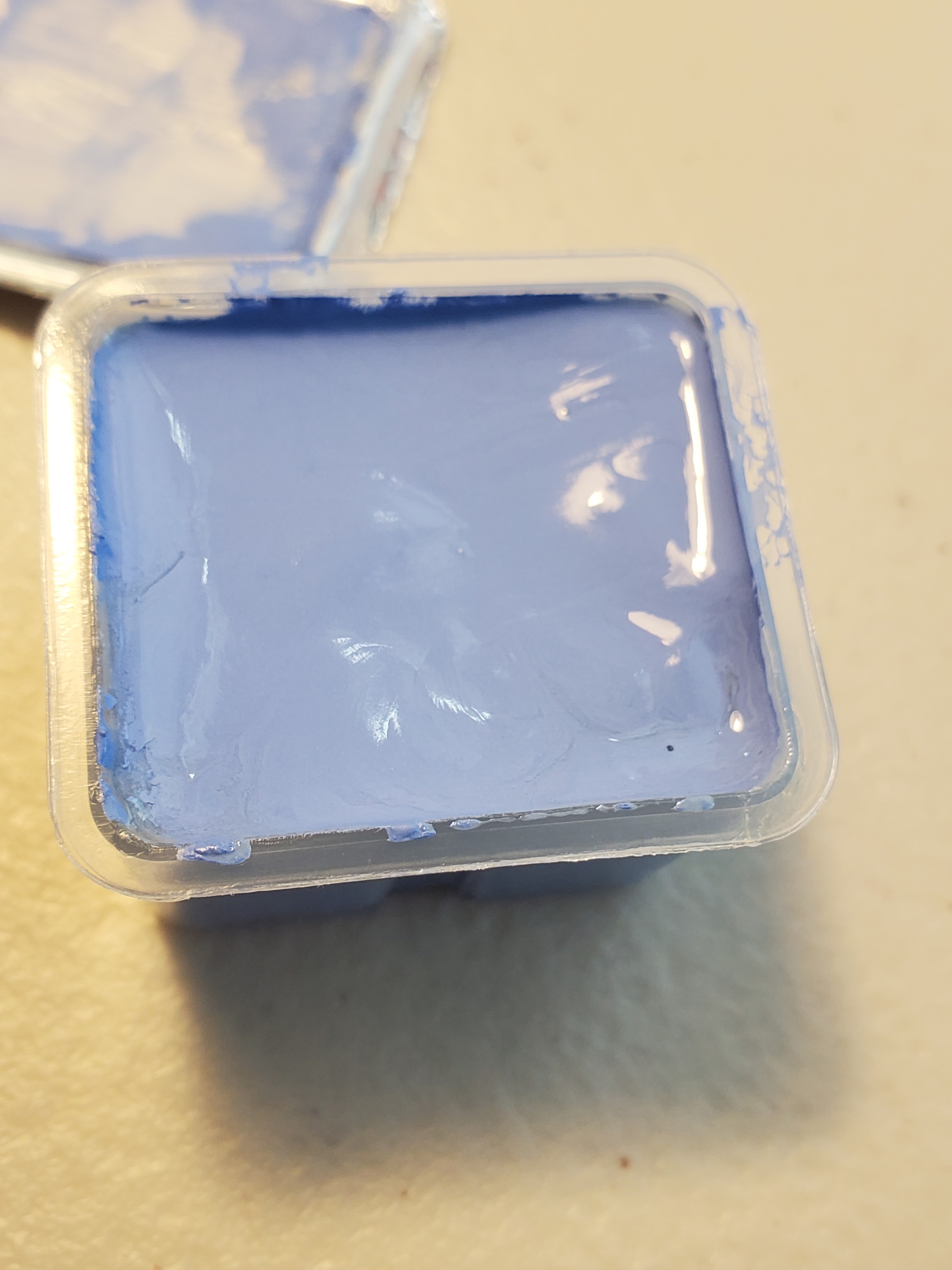

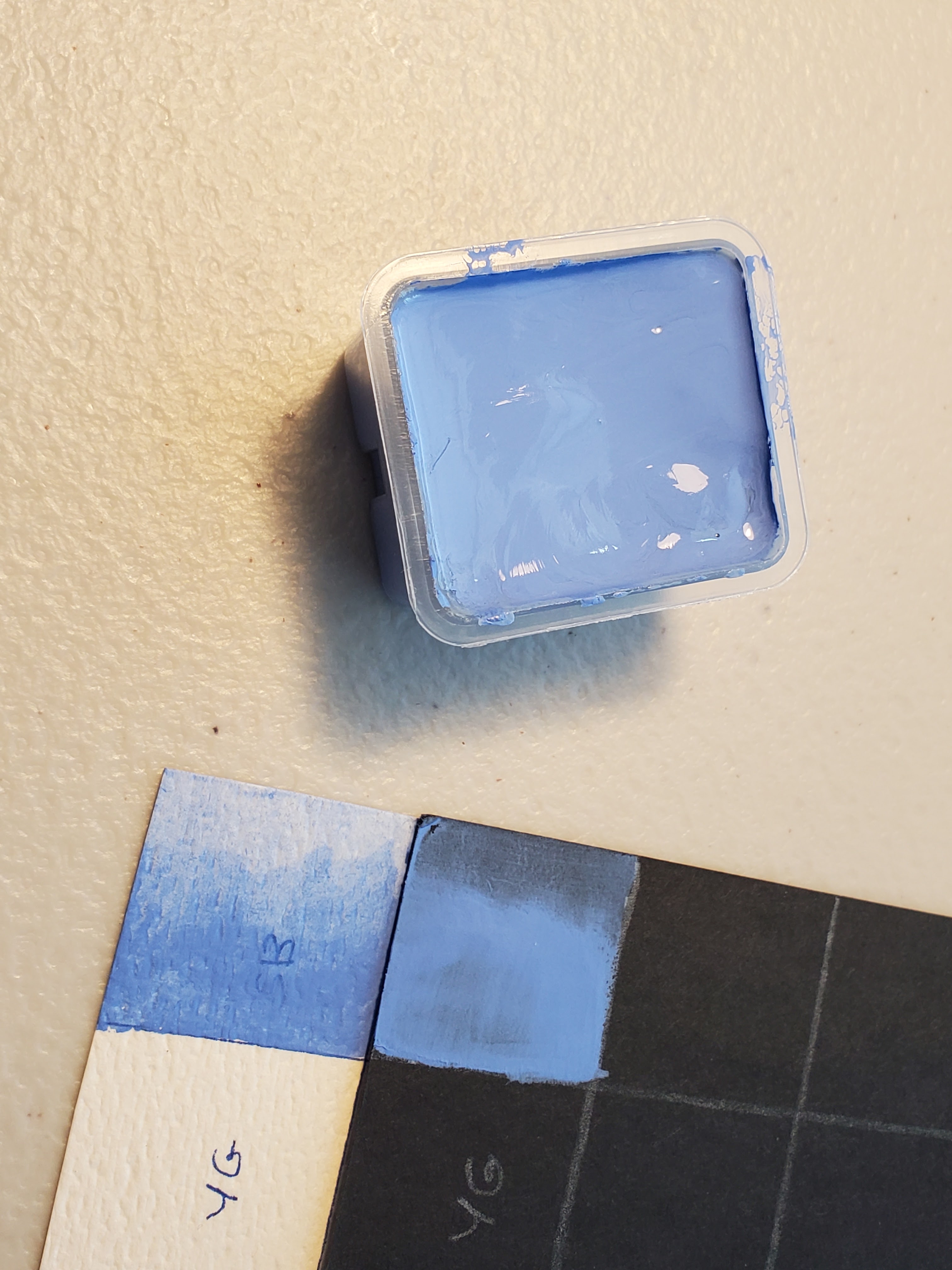
The Sky Blue applied smoothly and mixed with water easily to create a transparent wash with very minimal granularity. So far, so good, except that this “sky blue” is far too warm to be an accurate representation of actual blue sky, except perhaps at sunrise or sunset. It's a lovely color, but it's really more of a periwinkle blue. A good, sunny sky needs something more like cerulean. Alas, I couldn't start on my painting, yet, but I found my groove with the next two colors. For that, go here: https://allsortsartbyali.blogspot.com/2023/07/himi-jelly-gouache-color-review-white.html
For regular shenanigans, please follow my Facebook page, https://www.facebook.com/allsortsofart
Ah, yes. Picard and the flute (Ressikan flute, I believe it's called) he plays in not one but two episodes.
ReplyDeleteGood luck with your project. And yes, cerulean blue would be better for painting a summer day's sky.
Oh, thanks! He played a few instruments, if I am recalling correctly. Quite a talented guy!
DeleteI'm not sure if Jean Luc played other instruments. I do know that Commander William T. Riker (Jonathan Frakes) played a mean trombone and is a jazz fan. (In Star Trek: Insurrection, we do hear Patrick Stewart sing "A British Tar" from HMS Pinafore, though!
DeleteI was thinking there was an episode in which he played a kind of marimba, but maybe I'm thinking of someone else. I do remember Riker and the trombone!
Delete